You can color visualization items using a predefined color scheme.
A color scheme can be used as it is, or used as starting point for any
adjustments of the coloring.
About this task
Which predefined
color schemes are available differs depending on type of data values in the
column selected on the
Color by axis. Some of the color schemes have
built-in color rules.
Procedure
-
Right-click the visualization, and select
Properties in the opened menu.
The
Properties pop-over is displayed.
-
Click
Color.
The
Color section is displayed.
-
Make sure the column you want to color by is selected on the
Color by axis.
-
In the
Color scheme drop-down menu, select the color
scheme you want to use.
Note: Any
color rules in the applied color scheme are displayed in the legend.
Note: Accessible categorical is a color
scheme for categorical columns with a palette that is compliant with the WCAG
2.1 and conforms with Level AA or higher for the contrast between text and
background. There are two variants, one adapted for the light theme and one for
the dark theme.
Results
The color scheme is
applied.
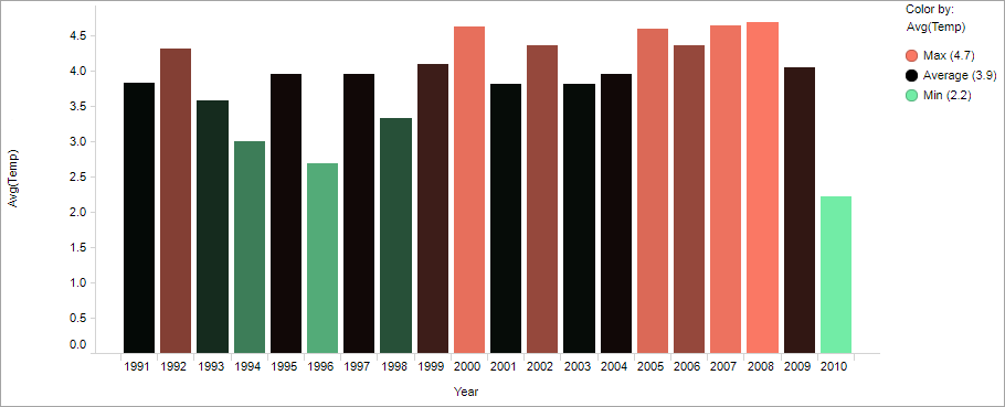
Example of color
scheme
The bar chart shows yearly average temperatures for a 20-year period.
Not only the bar heights reflect the temperature values but also the bar
colors. The
Min-avg-max
color scheme is applied. It represents values from Min to
average with a gradient transition from green to black. Items representing
values from average to Max are colored in a gradient transition from black to
red.