Custom expressions
You are not limited to the pre-defined aggregation methods; you can create your own expressions and apply them to the visualization axes. The custom expressions that you create can contain mathematical as well as logical parts. The result of such an expression on an axis is immediately reflected in the visualization, just as the result of any of the pre-defined aggregation methods.
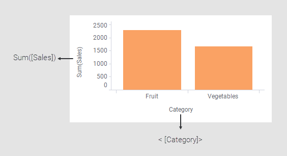
Actually, as soon as you make a selection on a visualization axis, your selection automatically results in a simple custom expression that you can access. For example, if you right-click each of the column selectors in this bar chart example and select Custom expressions, you would see the following expressions in the Custom expressions dialogs that open:
You can anytime change the expressions on the visualization axes either by using the pre-deined aggregation methods, or by creating your own custom expressions.
Because a custom expression is applied on a certain visualization axis, only the current visualization is affected, and other visualizations in the analysis stay unaffected. The results of the expression are not added to the data table, and with that, not available elsewhere in the analysis.
Whenever the visualization properties change, for example, by filtering, re-evaluations of the custom expressions take place automatically, and only those rows of data that are available after filtering are used in the calculations.
For information on how to create a custom expression, see Applying a custom expression.
Custom expressions work as pre-defined aggregations
Custom expressions work in the same way as predefined aggregations, with the distinction that custom expressions are not predefined by the system; they are set up by you. The similarity is illustrated in the example below that compares a well-known aggregation, average (Avg), and a custom expression that delivers the same result.
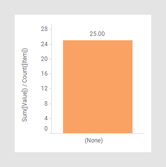
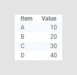
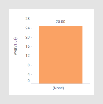
This data table contains four rows. The average value is 25, (10+20+30+40)/4.
In the bar chart below, the result is visualized by the selected pre-defined aggregation Avg.
The next bar chart shows the same result. Instead of using the predefined aggregation, the following custom expression has been applied:
Sum([Value])/Count([Item])