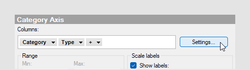
Axis settings
You can specify how categorical axes should behave in different situations from the visualization properties, or directly in visualizations (in the installed client).
 on the axis.
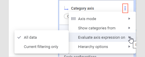
Changing the axis mode
The axis mode can in some visualizations be changed to define if the column or hierarchy on the axis should be treated as continuous or categorical. Many visualization types only support one type of axis mode, but, for example, the scatter plot can use either continuous or categorical axes.
- Continuous –
select this option for numerical columns when you want the values to be treated
as continuous, numerical values.
This option is not available for properties that are always categorical (like string columns).
-
Categorical – select this option when you want
the values to be seen as categories rather than numerical values.
For example, if you have the years 2021, 2022 and 2023 in a column, you would probably like to treat the different values as categories rather than numbers.
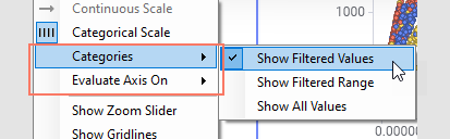
Specifying which categories to show
- Filtered values (or Show filtered values) – select this option to show values available after current filtering only. This means that those categories that are visible will change with the filtering and that categories currently without any values will be hidden from the visualization.
- Filtered range (or Show filtered range) – select this option to hide empty categories on both ends of the currently visible range. This means that those categories that are visible will change with the filtering, and that empty categories within the currently visible range will remain visible.
- All values (or Show all values) – select this option to keep all categories visible even if data for some categories have been filtered out.
Evaluating the axis expression
This setting is only applicable when the range of the available values on the axis is determined by the expression itself, that is, for column-based expressions such as ranking or binning. (For row-based expressions there will be no difference between the options.)
In the column-based cases, you will get different results upon filtering depending on whether the expression is evaluated before or after the filtering.
<BinByEvenIntervals([Age],3)> on an axis where
the age distribution ranges between 13 and 65 years, the unfiltered
visualization shows the age values split into three bins, as seen below: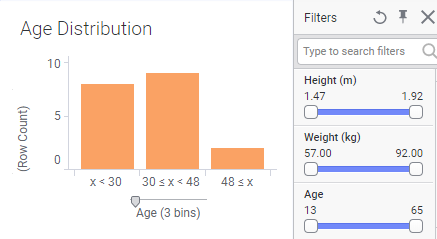
If the expression is evaluated on all data, the resulting bin ranges will remain the same upon filtering. However, if the evaluation is done on the current filtering only, the resulting bin ranges will change with the filtering.
- All
data – select this option to evaluate the axis expression before
filtering is applied and use all of the data to calculate the available ranges.
In the binning example above, the distribution of the available bins is calculated on the entire data volume. Filtering will not change the available bins on the axis, only the values therein:
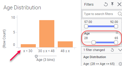
If one bin becomes empty due to filtering, it may be hidden depending on the settings you have specified under Categories above.
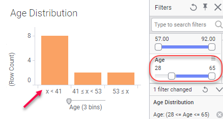
-
Current filtering only – select this option to
take the current filtering (as specified on the Data page) into account when
evaluating axis expressions.
Using the same binning expression as above, filtering on Age will recalculate the available bins with new bin intervals for each filtering when this option is selected:
If you are using in-db dynamic sets on the axis, then you must use this option, since the filtering affects which categories should be available (the content of the selected column varies with the filtering).
Hierarchy options
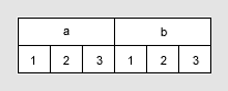
You can specify how hierarchies should be built, that is, which combinations of the different categories should be available. These options are available for hierarchical categories only, but not available for Date, Time or DateTime hierarchies.
- Actual
combinations (nest) – use this option to show all combinations
available in the data. For more information about the nest and cross
alternatives, see Categorical expressions, NEST and Cross under
Expression language details.
- All possible
combinations (cross) – use this option to show all possible
combinations, even showing categories that are currently not included in the
data.