Pie chart
A pie chart is a circle graph that is divided into sectors. It is used to compare values for different categories in your data on a relative basis. Each pie sector represents a specific category, and its size the category's contribution to the whole value, expressed as a percentage. The values are usually sums.
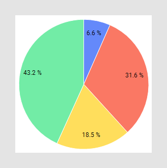
The main axes in the pie chart are the Color axis and the Sector size axis, which usually are reached from the legend:
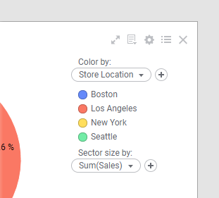
You use the Color by axis to divide the pie into sectors, and the Sector size by axis to specify what data the sectors' relative sizes should reflect.
In the visualization properties, you can edit things like the labels and tooltips and you can select to Sort sectors by size.
All visualizations can be configured to show data limited by one or more markings in other visualizations only (details visualizations). Pie charts can also be limited by one or more filterings. Another alternative is to configure a pie chart without any filtering at all. See Adding data limitations for a visualization for more information.
You can show data from multiple data tables in the same visualization if a proper data table matching is available. For more information, see Multiple data tables in one visualization and Column matches.