Spotfire for Oracle Smart View Users
If you are an Oracle Smart View user who is accustomed to do ad-hoc analysis, that is, if you are using Microsoft Excel spreadsheets with Smart View functionality for selecting members from a cube, there are a number of things you should think about when doing analysis in Spotfire.
When doing ad-hoc analysis in Excel, you often start off with all dimensions as columns, and a single measure on the row. No data is shown until you explicitly refresh the spreadsheet. If you are familiar with your working cube, you might also be used to the free-form mode, where you type member names directly into the cells and thereby slice your cube. In Spotfire, there is no free-form mode editing. Because Spotfire is interactive, you do not have to refresh your spreadsheet explicitly – the spreadsheet is automatically updated as you go.
The equivalent to the Excel spreadsheet in Spotfire is the cross table visualization. When you create a cross table visualization, Spotfire will suggest a measure as well as a dimension/hierarchy in the initial cross table. You can also view the data in the Data in analysis flyout, which shows you the available dimensions/hierarchies and measures.
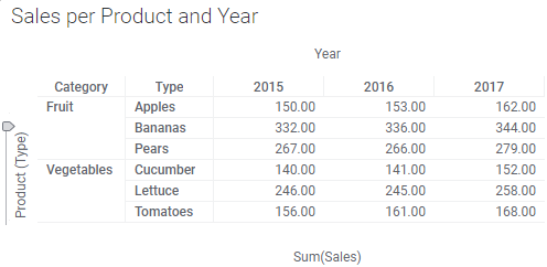
Because there is no free-form mode editing in Spotfire, you should not start off by dragging all hierarchies to the visualization and go from there. Instead, you select what measures or accounts to show in the cells by selecting the appropriate measure in the lower horizontal axis selector in the cross table (or by dragging the appropriate measure from the Data in analysis flyout to the axis selector). Also, in Spotfire, there is no explicit pivot operation. Instead, you select what dimension members to show on the vertical axis by selecting or dragging the dimension to the vertical axis selector. Similarly, you select which dimension members should be shown on the horizontal axis by selecting or dragging the dimension to the upper horizontal axis selector.
Note that you can have multiple dimensions on each axis. Those dimensions then become nested. Also note that multiple measures can be selected on the lower horizontal axis (value axis), but in that case "pivoting" is not possible.
In Spotfire, you slice your cube through filtering. That is, in the Data in analysis flyout, you click on the filter icon next to the dimension you want to slice. This brings up an appropriate filter in which you select the member for that dimension. Repeat this for each dimension that should be sliced.
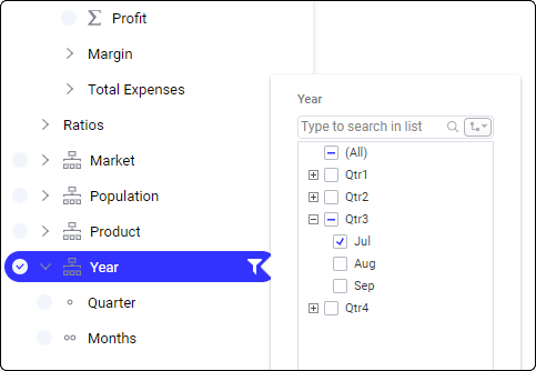
- Locate the member to slice by in the hierarchy filter by expanding the appropriate part of the hierarchy (click on the plus-signs before the parents to expand).
- Right-click on the member to slice by and select Deselect Other Values from the pop-up menu.
Often, the visualization will not show any data until all members to slice by have been specified (filtered) correctly. It is also common that query performance is bad until the cube has been sliced. Therefore, it might be better to define all the slicers before configuring the visualization correctly (by selecting the correct measures and dimensions on the axes).