For cross tables and heat maps, a color scheme is always applied to a color scheme grouping. A color scheme grouping functions as a container for one or more axis values on which you want to apply the same color scheme. You can add many color schemes to the same cross table or heat map, and it is possible to color by the columns on any of the axes. However, you can only color a cross table and a heat map by one column at a time, and if the cell values axis contains more than one column, you can only color by the cell values axis. To learn more about color schemes and how to set them up in different color modes, see Color Schemes Overview and Color Modes Overview respectively. The examples below illustrate how coloring can be applied to cross tables and heat maps.
In the cross table, more possibilities are available. You can
apply the coloring either to the background of the cells, or the cell texts.
let the color scheme for a grouping be based on another expression (or column) than the expression used for calculating the actual values that are displayed. See example below.
Note: The cross table can also be styled with different text color and background color without any connection to the cell values. See To change style of headers, columns, and rows in a cross table to learn more.
Example (one color scheme grouping):
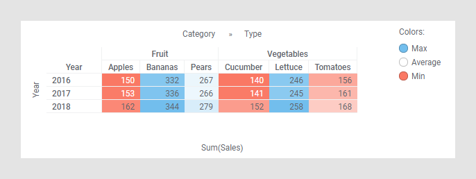
The cross table below shows the sum of sales (Sum(Sales)) for fruits and vegetables for the years 2016, 2017, and 2018. The horizontal axis has the two columns Category and Type. The column Category contains the two axis values Fruit and Vegetables, and the column Type contains the values Apples, Bananas, Pears, Cucumber, Lettuce, and Tomatoes. The cross table is colored by the column Category.
When you create a new cross table, one color scheme grouping (named Numeric) is created for each column represented on an axis in the cross table. The default grouping contains all the axis values in that column. Select a column in the Color by drop-down list to see its default color scheme grouping. In the example below, a part of the Colors page of the Cross Table Properties dialog is shown. The column Category was selected in the Color by drop-down list and its default color scheme grouping is displayed, as well as its two axis values Fruit and Vegetables.
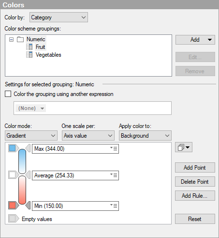
In the lower part of the dialog, the color scheme for the Numeric color scheme grouping is displayed. The color scheme is in Gradient color mode. The two axis values Fruit and Vegetables share the same color scheme, but the scaling is separate for them. This means that the three color points, Min, Average, and Max, are calculated per axis value. If you want to use a common scale for the axis values in the grouping, select the alternative (None) in the One scale per drop-down list. To see the scale for a column in the color scheme grouping, select it in the Color scheme groupings list. If the grouping itself is selected, as in the example, then the scale for the first column in the grouping is displayed.
Example (separate color scheme per grouping):
The example below shows a cross table with the same setup as in the example above except for the coloring. This cross table is colored by the column Type, and has two different color schemes applied to it.
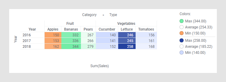
The color schemes are separated by a horizontal line in the legend. Below is a part of the Colors page of the Cross Table Properties dialog for this cross table.
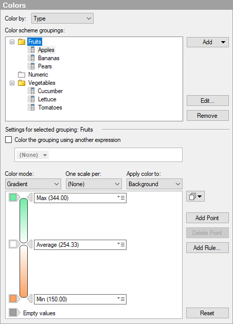
As can be seen in the upper part of the dialog, two color scheme groupings have been added. The first grouping is named Fruits, and the three axis values, Apples, Bananas, and Pears, have been added to that grouping. This is also the color scheme displayed first in the legend above. The second grouping is named Vegetables, and it contains the axis values Cucumber, Lettuce, and Tomatoes. The Numeric color scheme grouping is empty because all the axis values in the column Type have been added to either of the two new groupings. The default grouping cannot be deleted from the list of groupings. If you delete a grouping that you have added, then the axis values in that grouping will automatically be moved to the default grouping instead. Any added groupings will be shown in the list even if you change to another column to color by. The example below shows the Color scheme groupings list when the Color by column is set to Year.
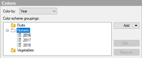
The two groupings Fruits and Vegetables are still visible, but you cannot expand them unless you change Color by back to the column Type.
Example (color scheme based on another expression):
Typically the color schemes for groupings in a cross table are based on the actual values that are displayed in the cross table cells. However, it is possible to let a color scheme for a grouping reflect another column or expression than the one used for calculating the cell values.
To illustrate this possibility, the data below is used. The 'Budget' column shows estimated monthly figures, and the 'Actual' column the outcomes. The bar chart shows that the budget was exceeded in Q3.
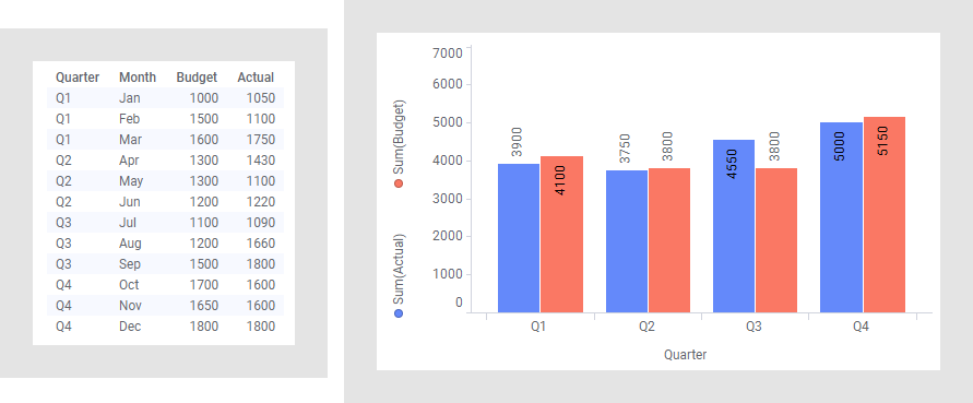
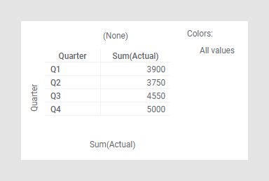
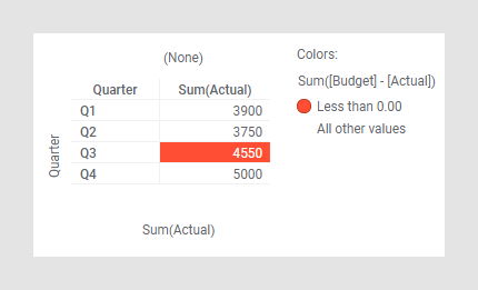
Below the 'Actual' totals per quarter are shown in a cross table.
Assume quarters that exceed the budget should be distinguished in this cross table. By selecting Color the grouping using another expression, you can use another expression for coloring the selected color scheme grouping. In this example, the expression 'Sum([Budget] - [Actual])' is used, which returns a negative result if the budget is exceeded. A color rule is added that applies a red cell background, if the result of the expression is less than 0.
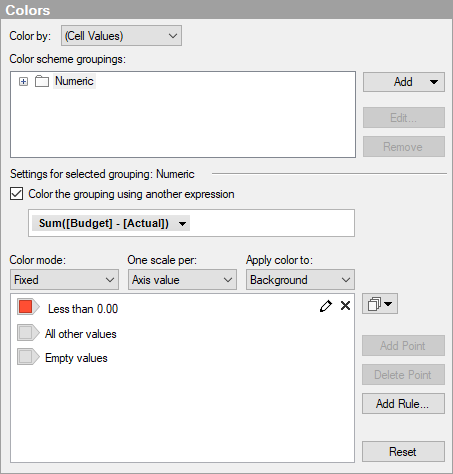
These settings will draw the attention to the exceeded budget in Q3.
Example (color scheme groupings in heat maps):
Coloring in heat maps works the same way as in cross tables. The example below shows a heat map where the Y-axis is set to the column Test, while the X-axis is set to (None). The individual cell values show the average of the three columns, Time 1, Time 2, and Time 3.
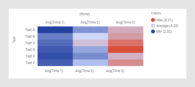
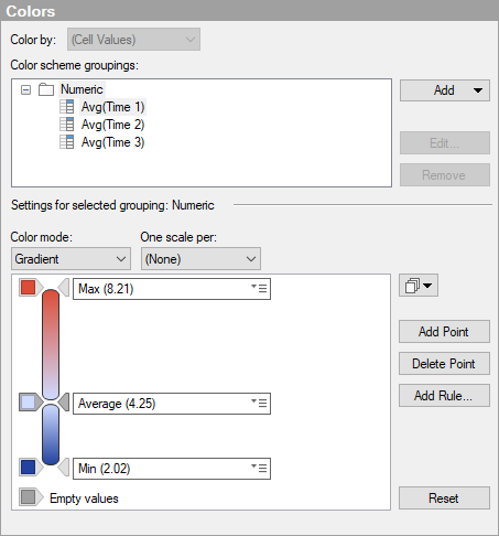
Below is a part of the Colors page of the Heat Map Properties dialog for the heat map above. The heat map is colored by (Cell Values), which is the only available option when the cell values axis contains more than one column.
To add a color scheme grouping:
Open the Visualization Properties dialog, and go to the Colors page.
Open the Add menu and select Color Scheme Grouping.
Response: The Add Color Scheme Grouping dialog is opened.
In the Name field, type a name to use for the new grouping.
In the Available axis values list, select the columns you want to include.
Click Add >.
Response: The selected columns are added to the Selected axis values list.
Click OK.
Response: The new color scheme grouping is added to the Color scheme groupings list.
Comment: An axis value can only be included in one grouping at a time. If you add an axis value that is already included in another color scheme grouping, the axis value will automatically be removed from the other grouping.