Dashboards are designed to present what is important in analyses, in an informative way. They can be used, for example, for analyzing, monitoring, or reporting purposes. Regardless if you design the dashboard to be consumed on a wall screen or a cellular phone, the data that is summarized in the analysis must be presented in a structured layout. Key parts of the analysis should catch the consumer’s eye instantly and the content should be understood without much effort from the user.
Dashboards may not only show a static view of the data; interaction capabilities can be built in for various purposes such as drill-down into data details and filtering data to certain values. The interactive dashboard can be designed so that the consumer gets instructions on the different tasks that can be performed, or the dashboard setup might even guide the consumer through the analysis in a specific order.
Not only the actual information is important; the look and feel of the dashboard also contributes to how a consumer perceives and understands the content. Using the most suitable visualization, a structured and well thought-out layout, legible texts, and colors that add value and are easy to distinguish enhance the understanding of the dashboard.
Many features are available to fulfill these different needs when creating dashboards. Most of the features are generally applicable, but are worth being gathered and accentuated in a dashboard context. See Useful Features when Designing Dashboards.
Example of a dashboard
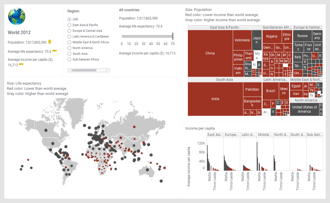
An example of an interactive dashboard is shown below.
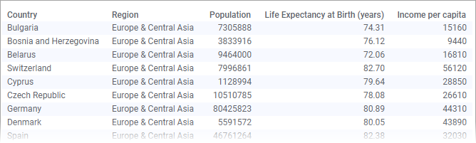
It is based on the following data table containing demographic data such as population, life expectancy, and income per capita for all the countries in the world*.
In the upper left of the dashboard, you are informed about the total population of the world, and the average life expectancy and average income per capita. As a supplement to the absolute figures, icons have been added to show the trend.
The visualizations are configured to provide overviews of relationships, real or potential ones, between some of the demographic variables:
In the map chart, the colored markers differentiate countries with life expectancy below average from countries above average. Not only colors are used to visually provide information; the sizes of the markers also make it possible to compare the expected life lengths between countries.
In the treemap, you get an overview of the populations in the countries (or regions) by comparing the sizes of the rectangles. Moreover, because the rectangle colors are defined to show whether the income per capita is higher or lower than the average in the world, you might find relationships between population sizes and incomes per capita.
In the bar chart, you can compare the incomes per capita across the different regions, and across the different countries within each region.
This dashboard also offers interaction possibilities. If you select a Region radio button, you can look into details for the selected region.
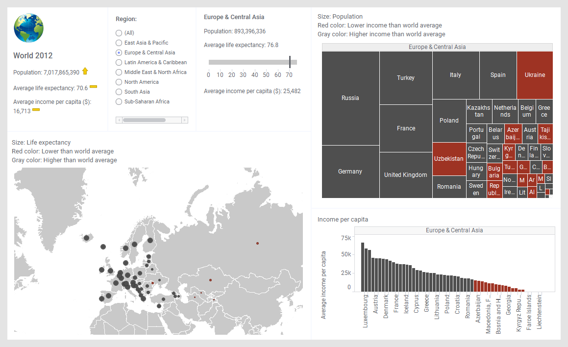
Above, Europe & Central Asia is the selected region, and the visualizations adapt to show only data for this particular region. The details for the region are found in the text area to the left of the treemap. The text at the top of the text area shows what region is selected. Moreover, to visually compare the life expectancy in the region to the world average, a bullet graph is used.
Note, however, that the numbers regarding the entire world have been set to stay unaffected.
* The data is attributed to The World Bank. The data is provided for demonstration of Spotfire functionality. Disclaimer of Endorsement or Liability - The World Bank does not endorse or recommend the use of Spotfire in any way. The World Bank and TIBCO make no warranties for this demonstration data.