The principles for creating a KPI are explained using a simple example.
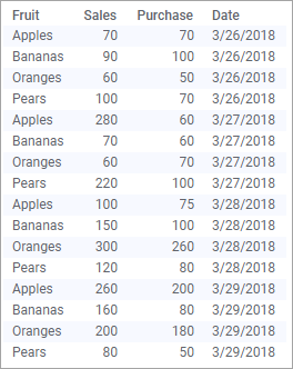
The data table below lists, for four days, the purchase and sales figures for some fruit types.
Assume you want to monitor the latest sales performance regarding the absolute figures for sales and purchases per day and fruit type. In addition, you want to easily spot if the relative net profit for any fruit type is very low, or very high.
Creating a KPI chart from scratch based on the data above results in this KPI:
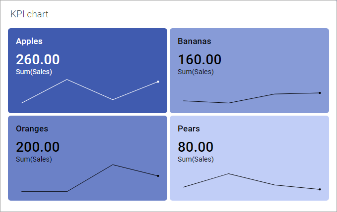
The latest daily Sales figures are shown as the primary value in each tile, and a sparkline, ended by a dot indicating the current value, shows the sales trend over the four days.
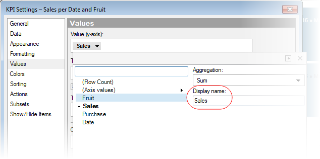
To view also the absolute purchase figures, another KPI value can be added to the tiles. In the KPI Settings dialog, the Values page, set Comparative value to Sum(Purchase):
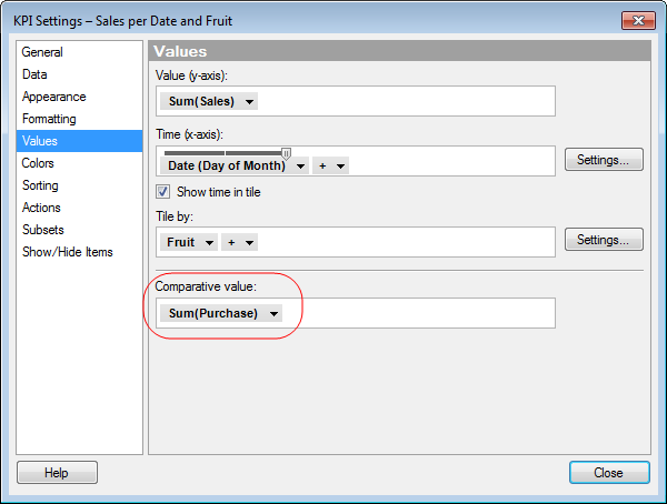
In addition, the Show time in tile check box above is selected to display the time period that the value is based on in the upper right corner of each tile.
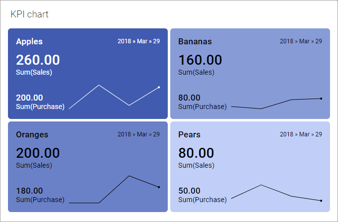
The latest absolute purchase figures can now be viewed:
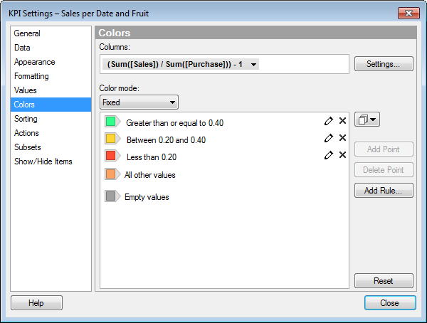
The background colors of the tiles can be used to indicate performance levels. By default, a gradient color scale is applied, but the color mode can be changes and color rules defined to distinguish different levels, for example, good, medium, and bad.
In this example, Color mode will be set to Fixed, and the color rules will be set up to signal bad performance in red, if the relative net profit is less than 20%, and in green, if it is above 40%. For values in between, the tiles are colored in yellow. The expression to use for coloring the tiles
(Sum([Sales]) / Sum([Purchase])) - 1
is specified on the Colors page, the Columns selector. This is also where also the color rules are specified via Add Rule:
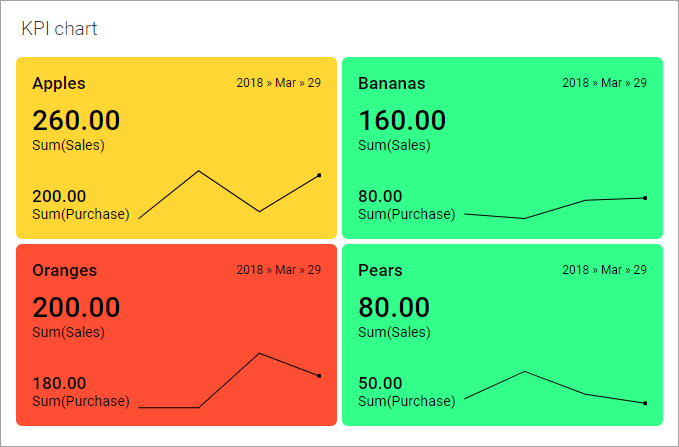
The colored tiles are shown below:
Note: A more generic expression for this measure is
THEN ([Y.FinalValue] / [Comparative.FinalValue]) - 1
This expression has the same effect as the one used to color the tiles above, but it refers to axis values instead of the actual data columns. For example, if Sum(Purchase) is specified on the Comparative value axis, the Sum(Purchase) values are referenced in the Comparative.FinalValue part of the expression, but if another expression is used on the Comparative value axis, its results are referenced instead.
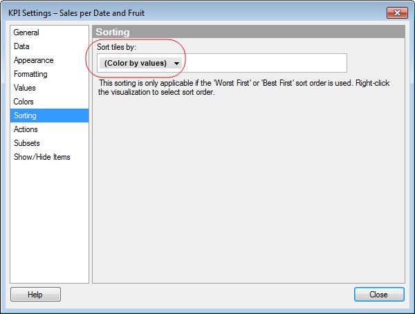
Maybe the tiles that indicate bad performance regarding the relative net profit are most important to monitor, and should be positioned on top. On the Sorting page, you can set Color by values as sorting order:
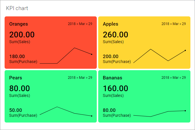
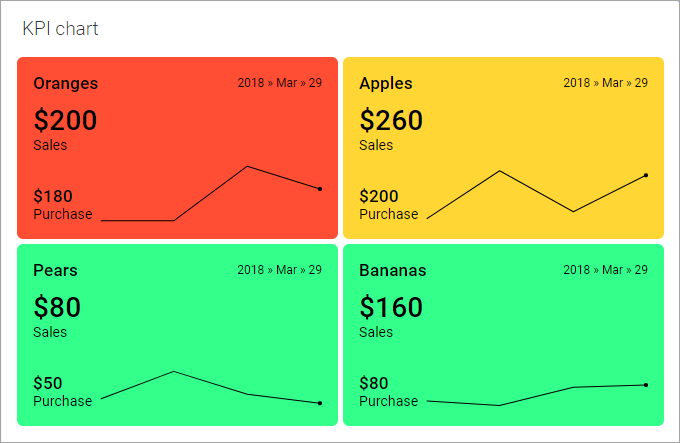
To apply the sorting, right-click the KPI chart, and select Sort Order > Worst First, to show the red tiles on top of the chart:
Moreover, you can change the formatting of the different KPI values. In the final KPI at the bottom, decimals have been removed. Also the display text for the values has been changed. This can be done in the expanded selector for the KPI value in question:
See the final KPI:
Note: On the Appearance
page of the KPI Settings dialog, you can
change the look of the sparklines, for example, add a scale. It is also
possible to remove them.
On the Appearance page
of the KPI chart Properties dialog, you can
customize the layout of the KPI chart. For example, you can choose to
start each KPI on a new row, specify the minimum tile width, or how many
tiles should at least be visible.