An analysis layout adapts automatically to smaller screens, for example, when consumed on cellphones. It is possible to modify this responsiveness for each separate page in the analysis.
You can also specify a minimum acceptable size of an analysis page to keep the content readable.
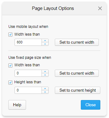
To modify the settings for the layout, right-click a page tab, and select Page Layout Options.
Note: If the visualization area is locked to a specific size, this dialog is not available. For more information, see Details on Document Properties – General.
Option |
Description |
Use mobile layout when |
When you use a mobile layout, the visualizations on the page are placed on top of each other, supplemented with a scroll bar. This layout is used when the screen width falls below a certain breakpoint. |
Width less than |
Select the check box and specify the breakpoint (in pixels). |
Set to current width |
Sets the current width of the analysis page as the breakpoint. |
Use fixed page size when |
When you use a fixed page size, the size of the area containing visualizations is kept also on small screens. Scroll bars are added that makes it possible to view all the content. This layout is used when the screen width or height falls below a certain breakpoint. |
Width less than |
Select the check box, and specify the minimum width of the visualization area that you accept. If the width falls below this breakpoint, a horizontal scroll bar is added. |
Set to current width |
Sets Width less than to the current area width. |
Height less than |
Select the check box, and specify the minimum height of the visualization area that you accept. If the height falls below this breakpoint, a vertical scroll bar is added. |
Set to current height |
Sets Height less than to the current area height. |