Creating a parallel coordinate plot
The parallel coordinate plot is used to compare data values of different types or magnitudes. All values are presented as points on a line, or profile, with one point per data column. Items that are similar to each other often show a similar profile.
Before you begin
Procedure
-
On the authoring bar, click
Visualization types
 to open the flyout.
-
Select the data columns you wish to include in the visualization:
-
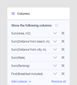
Open the visualization properties and locate the
Columns section. This looks slightly
different depending on which client and which properties interface you use. The
example below shows the visualization properties panel.

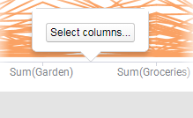
Tip: Alternatively, you can click on the axis (not on a column name) and click the Select columns button to edit the columns:
-
Open the visualization properties and locate the
Columns section. This looks slightly
different depending on which client and which properties interface you use. The
example below shows the visualization properties panel.
-
When applicable, select which aggregation to apply for each of the
columns to show:

Note: The aggregation settings are not available if (Row number) is selected on the Line by axis. See step 5.Tip: If there is no proper need to actually aggregate data (for example, when looking at text columns), you can use the aggregation First, which picks the first valid value.
Example
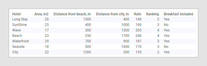
In the data table below, details about hotels at a tourist resort are
listed. The values in the columns are of completely different types and
incomparable to each other.

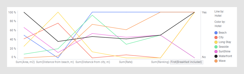
By creating the parallel coordinate plot below with one line per hotel, it is possible to compare the hotels and find a hotel that suits you. Here, the Color axis is used to split the data per hotel.

Perhaps Waterfront is a good choice, because you get a large room for a fair rate, and it is located not too far away from neither the beach nor the city. In addition, breakfast is included in the price, and the ranking is OK.
By creating the parallel coordinate plot below with one line per hotel, it is possible to compare the hotels and find a hotel that suits you. Here, the Color axis is used to split the data per hotel.
Perhaps Waterfront is a good choice, because you get a large room for a fair rate, and it is located not too far away from neither the beach nor the city. In addition, breakfast is included in the price, and the ranking is OK.
Tip: The
actual values in a column can be shown along the right-hand side of the
visualization. Click the X-axis label for the column you are interested in.