Creating a scatter plot
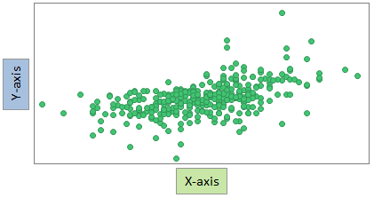
In a scatter plot, markers are displayed in a two-dimensional coordinate system. It is useful for getting an overview of how your data is distributed across two dimensions.
About this task
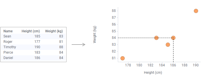
By default, each row in your loaded data table is represented by a marker. The marker's position in the coordinate system is defined by the row's values in the columns selected on the X-axis and the Y-axis. For example, the marker's position for the last row in the data table below is the coordinate 186 on the X-axis, and 84 on the Y-axis.
Procedure
-
On the authoring bar, click
Visualization types
 to open the flyout.
Examples
When visualizing data in scatter plots, you get a view of the
distribution. You may for example find that data forms groups, or that data is
more gathered.
The scatter plot can also be used to examine whether or not there is a relationship between the columns. The closer the markers are to a straight line, the stronger the relation. For example, the column values in the left-hand scatter plot below do not seem to be related, but in the right-hand scatter plot, a higher value on the X-axis seems, in general, to have a higher value on the Y-axis.
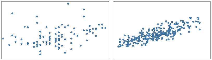
The scatter plot can also be used to examine whether or not there is a relationship between the columns. The closer the markers are to a straight line, the stronger the relation. For example, the column values in the left-hand scatter plot below do not seem to be related, but in the right-hand scatter plot, a higher value on the X-axis seems, in general, to have a higher value on the Y-axis.
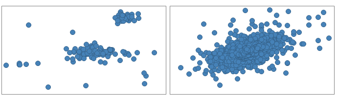
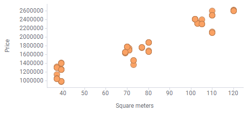
To illustrate how you can get an overview of the data distribution,
the following data table is visualized in the bottom scatter plot.
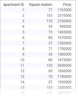
The data table lists areas and prices of a number of apartments. At a quick glance, it is easy to see that the objects appear in groups.
The data table lists areas and prices of a number of apartments. At a quick glance, it is easy to see that the objects appear in groups.