Creating a density plot
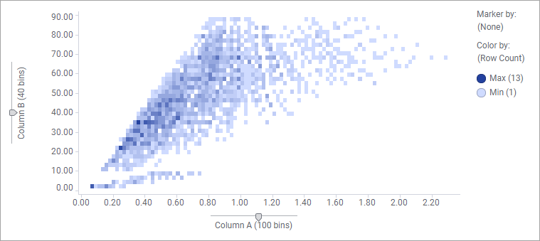
The density plot shows how numerical data, binned into intervals, is distributed across the X-axis and Y-axis. To visualize the density, that is, visualize to which extent the markers overlap each other totally, the Color by setting is used.
About this task
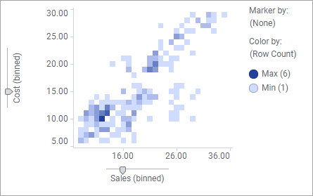
The markers that represent the binned values are shaped as tiles in a grid.
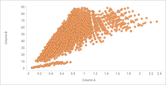
A density plot is created from a scatter plot visualization, but a pre-configured density plot can appear as one of the visualizations that is recommended to you, when you select two numerical data columns in the Data in analysis flyout. Then you can add it by simply dragging it to the visualization canvas. If you want to create the density plot from scratch, follow the procedure below.
Procedure
-
On the authoring bar, click
Visualization types
 to open the flyout.
Example
If you follow the procedure above, the plot that is created indicates the density by letting colors reflect how many data rows the tiled markers represent.