Error bars
Data might not always be precise, for example, in measurement data error margins might exist. When there is a need to visualize the uncertainty in the data, you can use error bars to indicate statistical probabilities of errors, or actual errors. The error bars represent upper and lower limits of the data relative to a marker's value, and they can be added to markers in bar charts, line charts, and scatter plots.
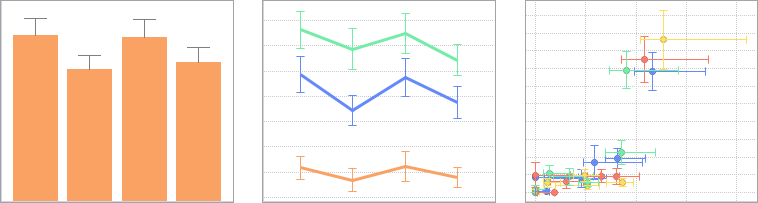
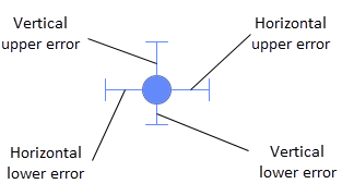
In all these three types of visualizations, upper and lower vertical error bars can be drawn. In scatter plots, the error bars can also be drawn horizontally.
If more than one column is selected on the axis selector, you can specify different error bars for each of the columns.
- let the length represent the actual values in a data column that contains absolute error figures.
- for aggregated visualization
items, use any of the pre-defined aggregation methods, for example, standard
error (
StdErr) or standard deviation (StdDev). - define your own method by writing an expression.
For more information on how to use the error bars, see Adding error bars.