Creating a pie chart
A pie chart is a circle graph that is divided into sectors. It is used to compare values for different categories in your data on a relative basis. Each pie sector represents a specific category, and its size the category's contribution to the whole value, expressed as a percentage. The values are usually sums.
Procedure
-
On the authoring bar, click
Visualization types
 to open the flyout.
Example
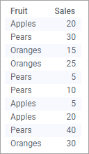
The data table lists the sales of different fruits.
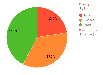
The pie chart below displays the different fruits' contributions to the total sales. Note the settings on the Color and Sector size axes.
The pie chart below displays the different fruits' contributions to the total sales. Note the settings on the Color and Sector size axes.