Bar chart
In a bar chart, you can compare values for different categories in your data.
There are two types of axes in the bar chart, a Category axis and a Value axis. In most cases, columns containing numerical data are selected on the Value axis, and columns with categories are selected on the Category axis.

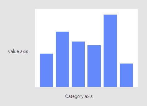
The heights of the bars represent a certain aggregated value for each of the categories. An aggregated value could be, for example, a sum or an average.
- Creating a bar chart
In a bar chart, you can compare values for different categories in your data. - Creating a stacked bar chart
In a stacked bar chart, the bars are split into colored bar segments placed on top of each other. The total height of a bar shows the numerical value for a certain category, and the heights of the bar segments represent how different components contribute to that value. - Creating a side-by-side bar chart
In a side-by side bar chart, the bars are split into colored bar segments. The bar segments are placed next to each other. - Creating a 100% stacked bar chart
In a 100% stacked bar chart, the bars are split into colored bar segments placed on top of each other. Each bar height is 100%, and the colored bar segments represent the components' relative contributions to the total bar. - Creating a horizontal bar chart
The bars in a bar chart are by default vertical. You can change the vertical orientation of the bars to horizontal. - Creating a histogram
In a histogram, you can show the distribution of numerical data. The entire range of the numerical values is divided into equal intervals on the Category axis, and for each interval, it is indicated on the Value axis how many individual data values that fall within it. - Showing values of bars
You can show the values of entire bars and bar segments. - Sorting bars by value
You can sort the bars in a bar chart by height. - Sorting bar segments by value
You can sort the bar segments within stacked bars by height. - Showing only top bars
Sometimes only the highest bars are of interest in a bar chart. In these cases, you can select how many of the highest bars to display and let the other bars be hidden.
Parent topic: Visualizations