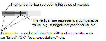
Bullet graphs
Bullet graphs are used to compare one value, represented by a horizontal bar, to another value, represented by a vertical line, and relate those to qualitative ranges.
The general idea of bullet graphs is that they can be included directly where they are needed, in the context of a graphical table or a text area, to provide information at a glance. In the example below, the bullet graph resides in a graphical table:
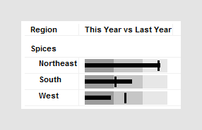
It compares sales performance for spices in different regions this year to sales performance last year. The background color ranges are qualitative ranges. In the example above they may for example indicate that if the bar is within the leftmost color range, sales performance is poor, while if it is within the rightmost color range, sales performance is good.
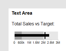
In the text area, the bullet graph can be displayed with a scale, as seen below:
Bullet graphs can be set up to change with filtering like any traditional visualization, or they can be locked to show fixed values using the settings in the Data properties for the Bullet graph.