Change Relative to Start
The Change Relative to Start expression shortcut calculates the percentage difference between a node and the first node.
Example
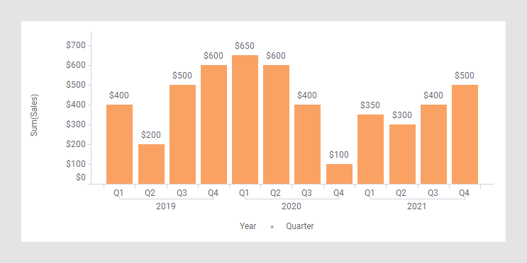
As starting point, the bar chart below is used. It shows the quarterly sums of sales for three years.
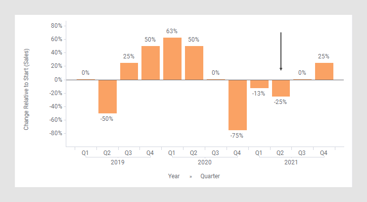
In the next bar chart, the shortcut expression Change Relative to Start has been applied on the Value axis. (The arrow points to a bar used to explain what is calculated in the expression further down.)
The following expression is used on the Value axis.
Sum([Sales]) THEN ([Value] /
		Sum(If([CategoryIndex.X]=0,[Value],0)) OVER (All([Axis.X])))-1
The first part of the expression specifies that the column [Sales] should be aggregated as a sum. The result of this part goes into the [Value] column to be used in the expression following THEN.
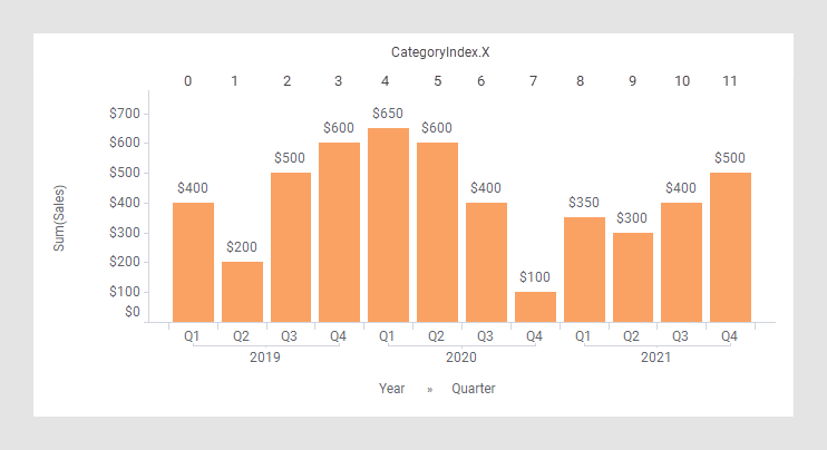
In the part following THEN, each node gets divided by the first node. This result is then subtracted by 1 to get the percentage. To identify which node is the first one, and reference it, [CategoryIndex.X] is used. As illustrated in the image below, each node is allocated an index, starting with 0, so [CategoryIndex.X]=0 for the first node.
The(If([CategoryIndex.X]=0,[Value],0)) OVER
(All([Axis.X])) expression finds and returns solely the the value of
the node with [CategoryIndex.X]=0, in this case the $400
value.
For example, calculation of Change Relative to Start for Q2, 2021 (see the arrow in the previous image):
-25%=$300/$400 - 1
(See the rectangles below.)

See also Change Relative to Fixed Point.
The column selector in expanded mode
In the installed client, the extended column selector offers controls that make it easy to change various parameters in the expression shortcut:
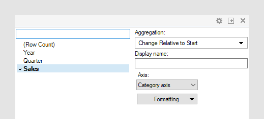
| Display name | Optionally, specify a different display name instead of the default "Change Relative to Start ([Column Name])". |
| Axis | Specify the axis over which to calculate
the nodes.
Only categorical axes that perform some kind of grouping can show up in the drop-down list. This means that if you only have a grouping on the X-axis, then this is the only axis available, whereas if you also have colored by a categorical column then the Color axis will be available as well, and so on. |
| Level | Change the formatting of the axis. For example, change to Number to show the values in numbers rather than as percentage. |