Dashboard features examples
The intention of the following examples is to give hints of what can be achieved, and inspire you to further investigations of the Spotfire features to get the dashboards you want.
Switching off filtering in a visualization
A typical interaction in a dashboard is filtering the data. By default, any filtering you do affects all visualizations on the page, if they are based on the same data table. There might be times, though, when you want a visualization to stay unaffected of the filtering, for example, if you want to use it as a reference. Then you can switch off the filtering for that particular visualization.
Go to the Properties for the visualization, and locate the Data section. Under Data limiting, remove all filtering limitations.
Example


This is possible because the filtering is switched off for the left bar chart by removing Use the current filtering from the page (and any other filtering) from the visualization properties, under Data.
Another alternative to compare all data to filtered data is the use of Subsets.
Making text dynamic
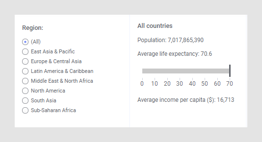
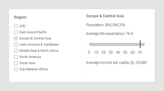
How this is done is described below.
- Right-click the text area and select Edit Text Area.
- Click Insert Dynamic Item, and select Calculated Value.
- In the Settings dialog for the calculated value, select Values.
- Right-click the Calculate values using selector, and choose Custom Expression.
- In the
Custom Expression dialog, enter the expression:
case UniqueCount([Region]) when 0 then "None" when 1 then First([Region]) else "All countries" end - Close the custom expression and calculated value settings dialogs.
- In the
Edit Text Area dialog, click
Save.
The dynamic Calculated value item shows the evaluation of the expression. If a region is selected in the filter control, the name of that region is displayed, and if the (All) option is selected, the result is 'All countries', respectively.