Modifying responsive layouts
The analysis layout automatically adapts to smaller screens, for example, when the analysis is consumed on cellphones. It is possible to modify this responsiveness for each separate page in the analysis.
About this task
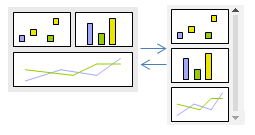
The order of the visualizations in this single column-based layout is determined by their placement on the analysis page. Visualization areas that have been locked are still locked, though, and locking them to the top edge will place them at the top in the column, and locking them to the bottom edge will place them at the bottom.
Note: It is not possible
to resize the visualizations using this layout.
The breakpoint, when the switch to or from this column-based layout should take place for an analysis page, can be specified.