Showing sparklines
Key Performance Indicators, KPIs, are used to monitor performance of a company. They reflect the performance for the most recent time period. If you want to see also the trend over time for a KPI value, you can show a simple line graph, a sparkline, in the KPI tiles.
About this task
Important: The
values presented in a sparkline are always the
primary values.
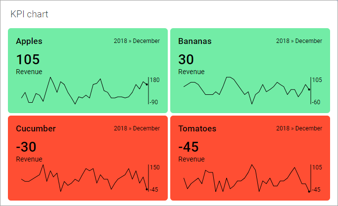
The dot ending a sparkline indicates the value of the most recent measure, and when on the time line it was measured. The sparklines can be supplemented with a scale showing the vertical range.
Procedure
Example
In the image above, multiple scales are used for the sparklines, and origin is not included in the scale.