Creating intervals of numerical data
Numerical data can be grouped into intervals. The intervals are named bins and can be handled as categories in an analysis.
About this task
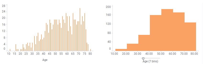
For example, if your data contains age information about a group of
people, you may want to arrange the ages into a smaller number of age groups as
illustrated below.

You decide how many bins the range should be divided into. When binning the data, a slider appears that can be dragged to the wanted number of bins. The bar chart below is based on the same data as above but adjusted to display more bins.

You decide how many bins the range should be divided into. When binning the data, a slider appears that can be dragged to the wanted number of bins. The bar chart below is based on the same data as above but adjusted to display more bins.
Before you begin
A numerical data column is selected on an axis.
Procedure
-
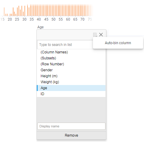
In the popover, click
 , and then select
Auto-bin column.
, and then select
Auto-bin column.

The range of values on the axis is divided into bins. A slider where you can change the number of bins supplements the column selector.
Results
Tip: If you
double-click the slider handle, you can enter the wanted number of bins in the
opened dialog. Then the range between the lowest value and the highest value in
the numerical data column will be divided into a number of intervals of the
same size.
Example
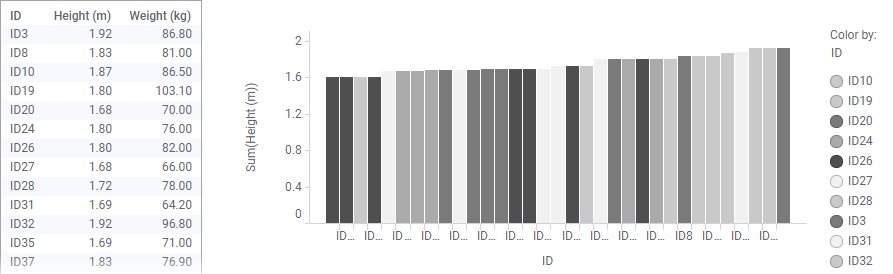
The table lists body heights and weights for 33 individuals, and each
individual's height is represented in the sorted bar chart.

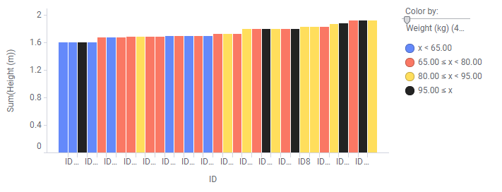
By coloring the bars by weight, and binning the numerical values, it is easy to distinguish individuals in certain weight intervals. In the image below, the range is divided into 4 bins. Individuals that weigh too much for their heights, can be spotted.

By coloring the bars by weight, and binning the numerical values, it is easy to distinguish individuals in certain weight intervals. In the image below, the range is divided into 4 bins. Individuals that weigh too much for their heights, can be spotted.
For example, the dark bar in the left part of the visualization stands out. This individual seems to weigh too much for his height.
For more examples, see Creating a histogram.