Creating a clean visual appearance
A cleaner visual appearance of the analysis below can be achieved using menu options reached from the visualization title bars, by changing settings in the visualization properties, and by using a customized visual theme.
The attributes to modify to get the cleaner look in the bottom image are indicated by numbers, and the actions made are described.
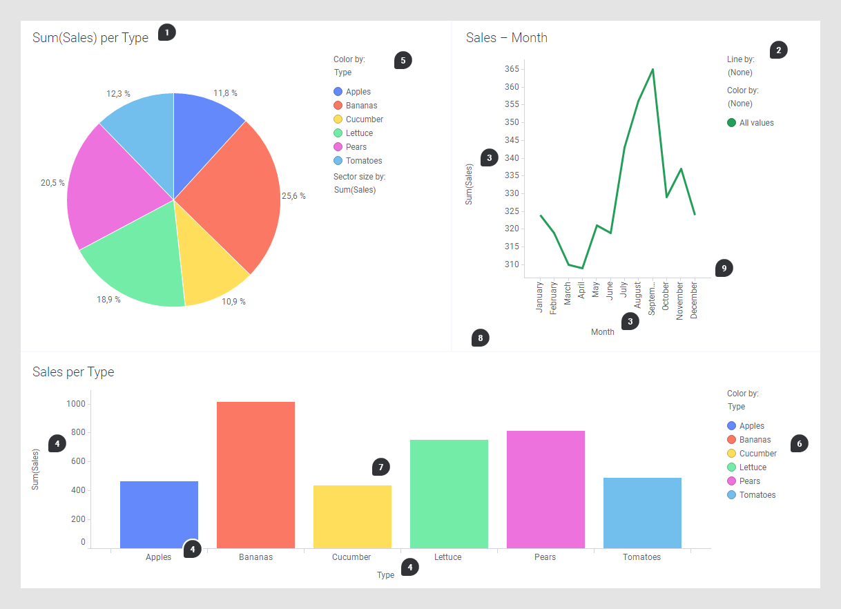
- Change titles by double-clicking the visualization titles and entering new titles, or hide titles completely, if they are not needed. Locate the Title bar card in the visualization properties panel and unselect Show visualization title to hide the title or click X to remove the card and hide the entire title bar.
- Remove the legend by moving
the cursor over the line chart title, and then click Legend,
 .
.
- Remove selectors by moving
the cursor over the line chart title bar, and then click
 to open the menu
(installed client only). Click X Axis Selector and
Y Axis Selector to remove these selectors. You
remove one axis at a time.
to open the menu
(installed client only). Click X Axis Selector and
Y Axis Selector to remove these selectors. You
remove one axis at a time.
- Remove selectors and scale
labels in the bar chart by moving the cursor over the bar chart title bar, and
clicking
to open the menu
(installed client only). Then click, one at the time,
Category Axis Selector,
Value Axis Selector, and
Scale Labels to remove them.
Tip: Scale labels can also be removed from the visualization properties panel, in both clients.
- Keep only the color information in the legend. In visualization properties, locate the Legend section and remove all items except Color by. Make sure that the Show title and Show axis selector check boxes are cleared in the settings for the Color by legend item.
- Move color items to the
horizontal view. In visualization properties, locate the
Legend section and remove all items except
Color by. Click
Show values horizontally. Alternatively, you can
move the cursor over the legend and click
 next to the Color by title
to move only the color values to the horizontal view. Move the cursor over the
horizontal color items, click the option icon
next to the Color by title
to move only the color values to the horizontal view. Move the cursor over the
horizontal color items, click the option icon , and select
Center and
Bottom. Remove the remaining vertical legend as
described in step 2.
, and select
Center and
Bottom. Remove the remaining vertical legend as
described in step 2.
- Add labels to the bars in the bar chart. In visualization properties, locate the Labels section and set Show labels to All. Below Types of labels, clear the Bar segments check box.
- Get a background without borders and background color. On the menu bar, select . In the Details tab, select Visualizations general, and set Borders to None. Select Canvas and set Distance between visualizations to 0.
- Remove lines and tick marks
on scales. On the menu bar, select
. In
the
Details tab, select
Visualizations scales, and set
Lines as well as
Tick marks to
None.
Tip: In addition to the numbered actions above, perform an action to separate the visualizations. In the Details tab, select Visualizations general, and increase the Padding number for All sides.Tip: To get a more uncluttered look, you can increase padding beneath the visualization titles. In the Details tab, select Visualizations titles, and click the Padding arrow. Then increase the Bottom number.
Result
The dashboard has now a cleaner appearance.