TIBCO Cloud™ Spotfire® User Guide

Adding color rules

By adding color rules, you can let the colors of specified items deviate from the ordinary coloring of the visualization items.

About this task

A color rule contains a condition and a color. All visualization items that fulfill the condition get the color you have specified. For example, you can add rules that let the top values, or values in a specified interval, stand out in a certain color. See some examples in Working with colors.

To specify conditions, different rule types are predefined. Which rule types are available depends on whether the column that is selected on the Color by axis contains categorical values or numerical values.

More than one color rule can be added to a visualization.

Procedure

  1. In the visualization properties dialog or popover, locate the Colors or Color section. In the visualization properties panel, add or expand the Color by section.
  2. Make sure the column you want to color by is selected on the Color by axis.
  3. Click Add rule or Add color rule depending on which client you use.

    In the visualization properties panel, a first assumption of a rule is added directly. Edit the custom expression or click to select a different rule type.

    If you add the rule from the visualization properties dialog or popover, a dialog opens. It looks slightly different depending on the client you use, but the same functionality is available. The dialog provides different rule types depending on whether the selected column on the Color by axis contains categorical values or numerical values. For details on the rule types, see Add/edit rule.

  4. Select a Rule type in the drop-down menu.
    Different rule types require different inputs such as fixed values that you type, aggregations selected from the drop-down menu, or custom expressions. For example, in a Top rule, the input is how many top values should stand out.
  5. In the dialog, specify the needed input in the field below Rule type by using the drop-down menu or by entering a value. In the visualization properties panel, this input is specified directly in the expression.
  6. Click the Color selector to open a palette and select which color to use for the items fulfilling the rule.
  7. Optionally, type a Display name for the added rule in the field. In the visualization properties panel, you can specify a display name by using the as expression. For example, the expression NthLargest([Axis.Color],5)<=[Axis.Color] as [Top 5] is shown in the legend as Top 5.
    The display name is shown in the legend. If you leave the field empty, the default rule type name is shown.
  8. Click OK.

Results

The color rule is applied to the visualization, and the added rule is shown on the Colors/Color section. To remove the rule, click the X to the right.

The images below show how the same three rules will look in the Colors section of the visualization properties dialog and panel respectively.

If the legend is visible, you can see all the applied rules in the legend as well.
Note: More than one color rule can be added to a visualization. The most recent color rule is added at the top, but you can change the order of the color rules. The order of the rules is important, because the rules are prioritized from top to bottom. See below for an example of rule priority.

Changing the order of the rules

To change the order of color rules in a visualization, open the visualization properties dialog or popover depending on which client you use, and locate the Color/Colors section. You can then click and drag the rule to the new position. In the visualization properties panel, click to the left of the rule to drag it.

Example of a color rule

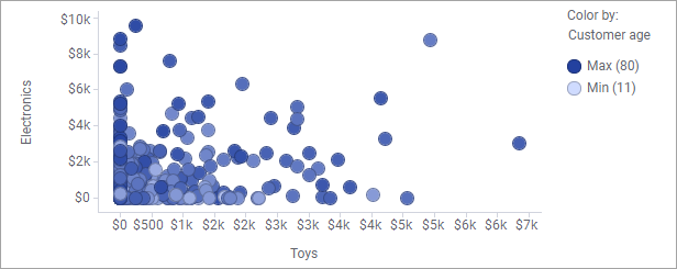
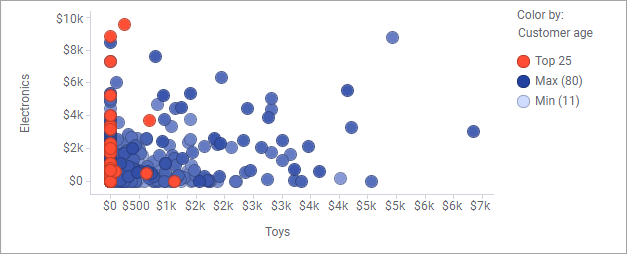
In the scatter plot below, the markers represent how much money each customer spent at the electronics and toys departments in a store. The gradient coloring of the marker indicates the age of the customers.


Assume you want to examine the buying behavior among the oldest customers. By adding the Top color rule with 25 as input value, the markers representing the 25 oldest customers are distinguished.


Example of color rule
Note: In the scatter plot above, also the Drawing order is specified to Customer age to draw the lowest values first in the plot, and the highest values last. This means all the markers of interest in this particular example are drawn on top of the others, and therefore not hidden behind others.
Tip: Color rules can be part of predefined color schemes. For example, the Top rule used above is in fact the Top n color scheme. The default n value in the color scheme is 10, but has been changed to 25 in this case.

Example of rule priority

The order of the rules, which can be viewed in the legend, is important, because the rules are prioritized from top to bottom.

The bar charts below show the sales of different fruits and vegetables. In both the charts, two color rules are added. One color rule is defined to show the two highest bars in yellow, and the other color rule to show bars between 700 and 900 in red. Note the different orders of the color rules, and the different coloring.


One bar, 'Pears', fulfills the conditions in both the rules. However, in the first bar chart, the 'Top 2 rule' overrides the 'Between 700 and 900' rule, and in the second bar chart, the opposite priority is applied.

Note: If a color rule does not have any effect on the visualization, it is not listed in the legend.