Line chart
A line chart is used for showing trends, and in most cases trends over time. It can also be used for discerning certain patterns.
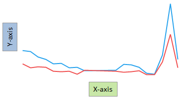
The main axes in the line chart are the X-axis and the Y-axis. To show trends over time, select a time column on the X-axis. For each data point on the X-axis, Y-axis values are placed. These values can represent aggregated data or non-aggregated data for the particular data point. An aggregated value could be, for example, a sum or an average. To draw the "full" line, straight lines are then drawn between these values.