Data can be organized in different ways, but still contain the
same information. Often, it is easier to visualize data organized in a
tall/skinny format, that is, when the values are collected in just a few value
columns, than if the data is in a short/wide format with a lot of columns.
Unpivoting is one way to transform data from a short/wide to a tall/skinny
format, so the data can be presented the way you want it in the visualizations.
About this task
You can select
several columns with similar values in the
Data in analysis flyout and combine them into a
single column which includes all values, using
Unpivot. If the data types of source columns
should differ, the varying data is converted to a common data type in the
combined column.
Before you begin
You must have some
data loaded in the analysis, and the analysis must be in
Editing mode.
Procedure
-
On the authoring bar, click
Data in analysis
 and click to select the
columns to combine.
and click to select the
columns to combine.
- To select a
consecutive group of columns, click the first column, press Shift, and then
click the last column.
- To select
non-consecutive columns, press Ctrl, and then click each separate column, or,
make sure to select the check box for each column.
-
Right-click on one of the chosen columns and select
Unpivot from the pop-up menu.
Results
The values from the
selected columns are combined into a single column called "Value". Also, a new
category column is created, where the previous column names are used as
categories.
Example: Combining
multiple temperature inputs to an average temperature
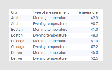
This example shows unpivoting of a very simple data table. In the
original data table, there are three columns and four rows. Each row contains a
city, a morning temperature and an evening temperature for each city:
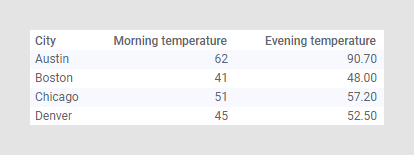
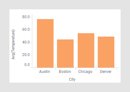
While this is certainly useful data, you may want to determine the
average temperature of all the cities for the whole day instead.
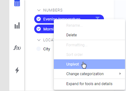
In the
Data in analysis flyout, click to select the
Morning temperature and Evening temperature columns, then right-click and
select
Unpivot.
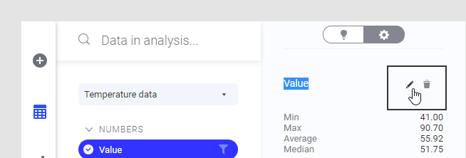
You can
change the names of the new columns in the flyout, if
desired. In this example, the name of the new value column is changed to
"Temperature", and the new category column is called "Type of measurement".
After unpivoting the data, there is one row for each measurement in
the data table.
Now, you can easily show an average value of the temperature in each
city, for example, in a bar chart.
Note: In the original
data, the morning temperatures were given as integers and the evening
temperatures as real numbers. In the unpivoted data table, all values must be
of the same data type. Therefore, the integers were automatically changed to
real numbers (because changing the real number temperatures into integers would
have resulted in a loss of information).
Example: Combining
sales data from several desks into a single column
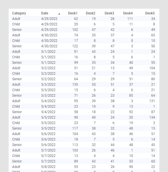
In this example, a larger data set containing data on the sales of
entrance tickets for a museum is used. The original data table shows data for
each of the five ticket counters (desks) and the number of tickets they have
sold to adults, children and senior citizens each day. The data is organized in
a short/wide format, that is, the spreadsheet has many columns with similar
data.
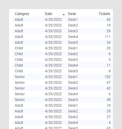
If you are more interested in analyzing ticket sales in general,
rather than needing to know which counter sold how many tickets to whom, you
can unpivot the data. This way, you can combine the Desk columns into a single
column, and merge all ticket sales numbers to another column.
In the data table below, the same data is organized in the
tall/skinny format. The values from the desks have been combined in one column,
called "Tickets", and "Desk" is the new category column showing from which desk
the tickets were sold.
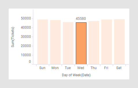
By doing an analysis of the new data table, you can show that
Wednesdays are the days when we sell the least amount of tickets.