Waterfall chart
A waterfall chart shows how a value changes after being affected by various factors that either increase the value, or decrease it. The resulting value is then presented.
The waterfall chart can, for example, be useful for visualizing the development of a value over time or visualizing the contributions of different factors to a total.

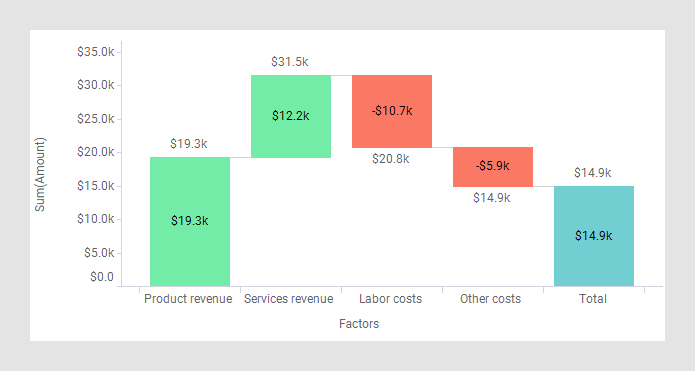
The starting value and the resulting value in the visualization are represented by bars, and the value changes in-between by floating blocks that indicate the ups and downs. As a means to follow the development of the value from start to end, transition lines can be added between the different blocks.
By default, positive value changes are indicated by a green color, and negative value changes by a red color. If you want, you can specify another coloring.
If applicable, bars representing intermediate calculated totals can be shown.
- Creating a waterfall chart
A waterfall chart is created in slightly different ways depending on how your data is organized, in a tall/skinny or short/wide format. - Showing intermediate total bars
In the waterfall chart, bars that show intermediate running totals can be shown. They can be displayed in waterfall charts where a categorical coloring is applied, and in waterfall charts with a hierarchy on the category axis. - Showing values of bars and blocks
You can show the values of the bars and blocks in the waterfall chart. - Showing waterfall per categorical color
In a waterfall chart where a categorical coloring is applied, it is possible to show one waterfall per color. - Showing waterfall per category on the category axis
In a waterfall chart where a categorical coloring is applied, it is possible to show one waterfall per category on the category axis. - Continuing a waterfall over trellis panels
In a trellised waterfall chart, the waterfall by default starts from zero on the value axis in each of the trellis panels. Another option is to let the waterfall continue over multiple trellis panels.