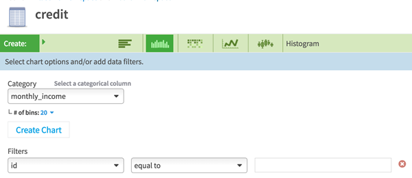
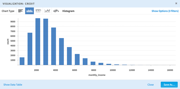
JavaScript must be enabled in order to use this site.Please enable JavaScript in your browser and refresh the page. Visualizing Data in a Workspace Table You can create a visual representation of your data, and dynamically add data filters, and switch axes and chart types. You can visualize your data with following types of charts: Frequency chart Histogram (currently only supports numerical data) Heatmap (currently only supports numerical data) Time Series Boxplot Prerequisites Procedure Click a table, and then click Visualize. Result Example: Related tasks Previewing Data in a Workspace Table Exploring a Data Source Analyzing Data in a Workspace Table Associating Datasets with a Workspace Importing Data into a Workspace’s Sandbox Copyright © 2021. Cloud Software Group, Inc. All Rights Reserved.