The Data panel is used to get an overview of the columns in all data tables, in-memory as well as in-database (in-db). When working with in-db data the Data panel is the starting point for configuring both visualizations and the filters panel, since no filters are created automatically for external data. Depending on the data source, there will be different sections available for a selected data table, see below for some examples.
Using the right-click menu in the Columns field, you can easily specify that a column contains geocoding information, that is, information that can be used to position data on a map.
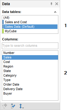
In-Memory Data and In-Database Relational Data from a Single Table
Data from in-memory data tables, or if the relational data is based on a single source table, is simply displayed as a list of the available columns in the selected data table,
Number |
Section |
Description |
1 |
Data tables |
[Only available if more than one data table has been added to the analysis.] Lists all data tables in the analysis. Related tables have the same color on the color stripe. |
2 |
Columns |
Lists all columns available in the selected data table. |
In-Database Relational Data from Joined Tables
If data tables from in-db databases have been joined with relations in the Views in Connection dialog, they can be treated as a single, virtual data table within Spotfire. In this case, there will be an additional field showing the source structure in the data panel as seen below. If no relations have been defined, each data table in the external data connection will be a separate data table within Spotfire as shown above.
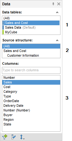
Number |
Section |
Description |
1 |
Data tables |
[Only available if more than one data table has been added to the analysis.] Lists all data tables in the analysis. Related tables have the same color on the color stripe. |
2 |
Source structure |
[Only available if the selected data table in Spotfire is built from more than one tables from the original database in a virtual join view.] Lists the underlying source structure from the database so that you can see which columns come from which original database table. |
3 |
Columns |
Lists all columns available in the selected data table. |
Microsoft SQL Server Analysis Services Cube Data
When you are working with Microsoft SQL Server Analysis Services cube data you will see more fields in the Data panel than for the relational data tables:
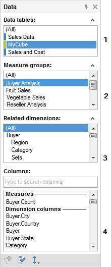
Number |
Section |
Description |
1 |
Data tables |
[Only available if more than one data table has been added to the analysis.] Lists all data tables in the analysis. Related tables have the same color on the color stripe. |
2 |
Measure groups |
Lists all measure groups in the cube. If there are measures that do not belong to a specific measure group, they can be located through the virtual group "(Other measures)". |
3 |
Related dimensions |
Lists all dimensions within the cube that are related to the selected measure group of the selected data table. |
4 |
Columns |
Lists all measures, attribute hierarchies and user hierarchies available in the selected data table, measure group and related dimension. Note that measures and dimension columns are divided into two different groups, in order to help you setting up relevant visualizations. See Working With Microsoft SQL Server Analysis Services for more information. |
SAP BW Cube Data
When you are working with SAP BW cube data you will see a slightly different Data panel:
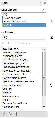
Number |
Section |
Description |
1 |
Data tables |
[Only available if more than one data table has been added to the analysis.] Lists all data tables in the analysis. Related tables have the same color on the color stripe. |
2 |
[Drop-down list] |
Allows you to select to show either all columns or just Key Figures or Characteristics in the list of columns below. |
3 |
Columns |
Depending on the selection made in the drop-down list either all key figures and characteristics available in the selected cube or only key figures or characteristics are shown. Note that if all columns are shown, key figures and characteristics are divided into two different groups, in order to help you setting up relevant visualizations. |
Toolbar
All flavors of the Data panel have a toolbar at the bottom of the panel:
Button |
Description |
|
[Only available for in-db data tables and only for columns that currently do not have a corresponding filter.] Creates a filter for the selected columns. Tip: To delete a filter, right-click on the filter in the Filters panel and select Delete Filter from the pop-up menu. Note: When working with cube data it is not possible to create filters for measures or sets, only for dimension columns. Note: Since the hierarchy filter cannot handle more than 500 nodes per level it is not useful to add filters for hierarchies with more nodes. |
|
Opens the Column Properties dialog where you can view detailed information about all columns, change the name of a column, add custom column properties, etc. |
|
Allows you to change the sorting of the columns in the list from the original database sorting to an Ascending or Descending alphabetical order. Note: If the selected data table is a cube then the different types of columns are sorted respectively within their section. |
You can use drag-and-drop from the Data panel to configure visualizations or to create filters. If hierarchies are available in the data panel columns list, they can also be dragged and dropped to utilize a hierarchy slider in a visualization.
See also:


