Aggregation is the grouping of data using statistical measures or other calculations. For example, you could select to show the Sum of all Sales for a year or the Average Sale for each month.
To use aggregation, your visualization must meet the following requirements:
The underlying data table must contain at least one numeric column. For example, an Integer, Real, or Currency column.
The visualization type must support aggregation. Some visualizations, like Tables, do not support any aggregation. Others can use aggregation on the coloring axis or some other axis only.
In visualizations which support aggregation you can aggregate the data using one or more column selectors, for example, the axis selectors or the color selector.
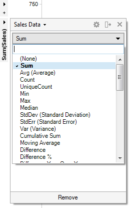
Click on an axis selector and look in the aggregation menu to show a list of all available measures you can use for aggregation. In some visualizations you may also choose (None), which will remove aggregation from this axis. Type in the search field to look for a particular aggregation method.
The different options available are statistical measures that may be used to aggregate the data column. There may also be a number of measures available that are in fact shortcuts to slightly more complicated expressions. For a complete list of what aggregation measures are available in TIBCO Spotfire, see Aggregations Overview. Not all aggregation measures will be available at all locations.
Missing Aggregation Menu?
Some visualizations, for example scatter plots, are not aggregated by default, when using in-memory data. Instead, they display one item per row ("Marker by" is set to (Row Number)) and the aggregation menu is not available in the axis selector. To display the aggregation menu you need to remove the (Row Number) selection from Marker by or to use the column by which you want to aggregate on the Marker by selector. An axis needs to be aggregated if you, for example, intend to display scatter plot markers as pies.
See also: