
When you open data in TIBCO Spotfire and create a visualization, you can select what will be shown on each axis in the visualization using column selectors:
These are found in three different places:
On the axes of a visualization,
In the legend of a visualization,
In dialogs.
For the most part, column selectors behave in the same way regardless of where they are found in the application. Clicking on the selector brings up a list of all available columns, together with any aggregation measures. See Non-Column Selections to learn about menu alternatives which are not columns. It is also possible to search for columns and expressions in a search field. See below for more details on search. Right-clicking on the column selector will display a different menu, where some additional options can be changed, like the possibility to add multiple columns simultaneously by choosing Select Columns....
Expanded and Collapsed Mode
The column selectors can be either in collapsed
mode, showing only the list of columns, the search field, and, if applicable,
an aggregation menu. Click on the expand icon,  , at
the top of the column selector to expand it. All column selectors will
be opened in the mode used the last time a column selector was used.
, at
the top of the column selector to expand it. All column selectors will
be opened in the mode used the last time a column selector was used.
Collapsed:
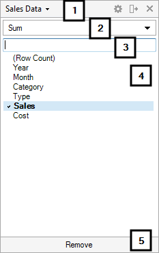
Number |
Section |
Description |
1 |
Data table |
[Only available when more than one data table is included in the analysis and the main data table of the visualization has at least one column match in another data table.] Allows you to select the data table from which to choose columns. |
2 |
Aggregation menu |
This is where you select how to aggregate your data, when applicable. |
3 |
Search field |
This is the search field, as explained below. |
4 |
List of columns or search results |
Lists all available columns, or, if you have performed a search, lists the result from the search; including columns, aggregations or recent expressions. |
5 |
Remove |
Removes all columns and expressions from this part of the axis. |
If desired, the column selector can be in expanded mode where you can also type a display name and view or edit the underlying axis expression.
Expanded:
Click on the collapse icon,  , at the
top of the column selector to collapse it.
, at the
top of the column selector to collapse it.
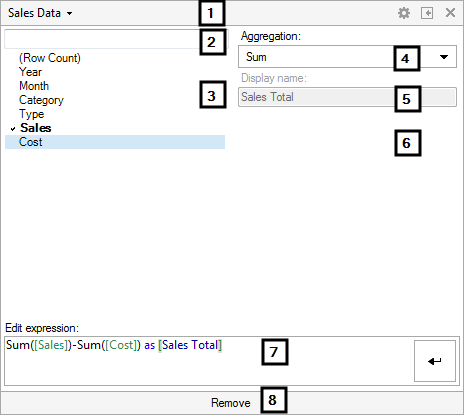
Number |
Section |
Description |
1 |
Data table |
[Only available when more than one data table is included in the analysis and the main data table of the visualization has at least one column match in another data table.] Allows you to select the data table from which to choose columns. |
2 |
Search field |
This is the search field, as explained below. |
3 |
List of columns or search results |
Lists all available columns, or, if you have performed a search, lists the result from the search; including columns, aggregations or recent expressions. You can right-click on a column in the list and insert the column directly into the expression at the current cursor location. You can also right-click on a column and insert the column using a specified aggregation method. |
4 |
Aggregation menu |
This is where you select how to aggregate your data, when applicable. |
5 |
Display name |
Allows you to specify a display name to use instead of the current expression. Note: If you are manually editing the expression the display name field will be unavailable until you click Apply in the Edit expression field. |
6 |
[Additional controls] |
Some aggregation methods also display additional controls here in expanded mode. See Expression Shortcuts Overview for more information about the available controls for each aggregation method. |
7 |
Expression field |
Allows you to view or manually edit the current expression. Note that columns from other data tables than the main data table need to be entered using their qualified name, that is, [Data Table Name].[Column Name] in the expression. If you edit the expression, an Apply button in the shape of a bent arrow will show up. Click on the apply button when you are done editing the expression to enable the Display name field again. You can also press Ctrl+Enter on the keyboard to apply the expression. Right-click in the expression field to get access to Recent Expressions. See Expression and Script Editor Keyboard Shortcuts for some helpful keyboard shortcuts. Note: The expression you see in the column selector only applies to that particular part of the axis expression. This means that if you have multiple columns on an axis and you want to edit the expressions for all columns, you must either open the column selector for each column, or, right-click on the column selector and select Custom Expression... to edit the entire axis expression at once. |
8 |
Remove |
Removes all columns and expressions from this part of the axis. |
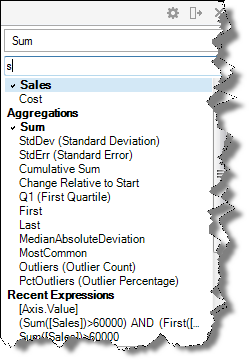
When you start typing in the search field of a column selector, all columns containing the entered letters will be listed in the selector. You will also get a list of aggregation methods and/or any recent expressions where the entered letters are included:
Below are some simple examples of what you can do with an axis selector like this one:
To switch column on an axis:
Click on the arrow next to the name of the previously used column.
Comment: In the example above, the arrow next to Year.
Select a new column from the menu.
Comment: All columns that are allowed on the specific axis will be shown.
Response: The visualization is updated to use the new column.
To switch column on an axis using drag and drop:
Select a filter in the filters panel that corresponds to the column you want to use on the axis.
Drag that filter from the filters panel to the axis selector area.
Response: A visual indication is shown depending on where you position the dragged filter.
Drop the filter straight onto the axis selector.
Response: The visualization is updated to use the new column.
On most of the axes, you can select to display more than one column simultaneously. This will create a hierarchical structure on the axis, as seen below:
![]()
To add a column to an axis:
Click on the arrow next to the plus sign on the axis of your choice.
Select a new column from the menu.
Response: The visualization is updated to show data from the new column as well as from the old one.
If desired, you can rearrange the order of the current axis columns using a drag-and-drop operation.
Comment: See "Hierarchies" for more information.
To add a column to an axis using drag and drop:
Select a filter in the filters panel that corresponds to the column you want to add to the axis.
Drag that filter from the filters panel to the axis selector area.
Response: A visual indication is shown depending on where you position the dragged filter.
Drop the filter next to the axis selector where a thick black line appears.
If desired, rearrange the order of the current axis columns using a drag-and-drop operation.
Comment: See "Hierarchies" for more information.
To remove a column from an axis:
Click on the arrow next to the name of the column you wish to remove.
Click Remove at the bottom of the column selector.
Response: The column is removed from the axis and from the visualization.
Tip: You can also right-click on the column selector and select Remove or Remove All from the pop-up menu.
To use a custom expression on an axis:
If you just want a simple custom expression you can type it directly in the Edit expression field of the expanded column selector for the interesting axis.
For more complex expressions, right-click on the axis of your choice.
Select Custom Expression... from the menu.
Comment: See How to Insert a Custom Expression for more information.
To change the display name on a column selector:
Click on the column selector you want to modify.
Make sure that the column selector is in Expanded mode.
Under Display name, enter the name you want to display on the column selector.
Close the column selector.
Response: The text you entered is now displayed on the column selector.
Comment: If multiple columns are used on an axis, you can change the display names for each of the columns by repeating the steps above for each separate column selector.
Comment: You can also change the expression itself to modify the name. See below to learn how.
To change display name on a column selector by modifying the entire expression:
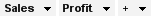
If you are writing complex custom expressions involving more than one column you may want to change the display names on an axis by modifying the expression behind the axis directly using the "AS" keyword. Using a simple example, you may have a line chart where the Y-axis shows one line for sum of sales, and another line for sum of gross profit. The column selectors would then appear as seen below:

You may want to shorten the names on the column selectors to say just Sales and Profit respectively. To do that, follow the steps below:
Right-click on the column selector you want to modify.
Select Custom Expression... from the menu.
Under Expression, you will see this text string: Sum([Sales Total]), Sum([Gross Profit]).
Now modify the text string to say this instead: Sum([Sales Total]) AS Sales, Sum([Gross Profit]) AS Profit.
Click OK.
Response: The display names on the two column selectors
will now be Sales and Profit:
Comment: If the lines have different colors, you may have to readjust
the coloring manually after you have changed the display names on
the column selectors.
Comment: If you only want to change one or some of the names on an
axis, just leave the other ones as they are.
To dynamically change the column used on an axis by marking in another visualization:
Right-click on the axis of your choice.
Select Column from Marked... from the menu.
Comment: See What is Column from Marked? and Details on Column from Marked for more information.
To use a property on an axis:
Right-click on the axis of your choice.
Select Set from Property... from the menu.
Comment: See Using
Properties in the Analysis and Details
on Set from Property for more information.
Note: This is a shortcut to set a property on the axis. You
can do more advanced expressions involving properties in the Custom
Expression dialog.
In the legend of a visualization, there are different types of selectors, depending on what kind of visualization you are currently viewing. These selectors provide dimensions to your visualization beyond what axis selectors can do. Right-click anywhere in the legend to open a menu where you can select which selectors are to be visible in the legend. For more information, see Legend.
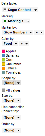
Each of these options are explained in detail in the visualization properties descriptions for each type of visualization.
Note that the column selector Marker by in a scatter plot may affect how other column selectors in the visualization can be configured. If you choose to let markers represent the contents of a column, rather than using the row number, and the data in this column is possible to aggregate, the Aggregation menu will be activated in the appropriate column selectors. TIBCO Spotfire will also try to set the axis selectors to the most meaningful aggregation. See Aggregation for more information.
Select Remove from a column selector to remove any selections made. For example, removing all columns from the Size by option in a scatter plot and setting it to (None) will make all markers be of the same size instead of letting the size depend on a certain column.
The Data table selector allows you to specify the main data table to be used in the visualization. See Multiple Data Tables in One Visualization for more information about the main data table. The Marking selector specifies which marking (if any) to use in the visualization.
See also: