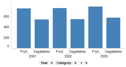
By adding more than one column to the axis selectors, you can create a hierarchy in the visualization. In the example below the column Year and the column Category have been added to the category axis. The bar chart automatically displays a bar for each combination in the hierarchy - in this case the sale of fruit and vegetables per year.
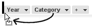
You can change the hierarchy order, if you prefer to see the bars in another way. Drag the Category axis selector and drop it to the left of the Year axis selector.
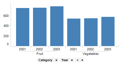
This causes the bar chart to change the order of the bars. As you can see below, the bars concerning fruit sales are now placed next to each other. Note how the hierarchy displayed in the labels below the bar chart corresponds to the order of the axis selectors.
The order of columns can also be changed in the Visualization Properties dialog, either by drag-and-drop, or, by right-clicking on a column selector and selecting Move Up/Move Down or Move Left/Move Right from the pop-up menu.
Using predefined hierarchies, you can create even more powerful axis hierarchies and get access to the hierarchy slider - a tool that helps you change the level of detail in a visualization fast and easily. Predefined hierarchies are also necessary if you want to set up hierarchy filters.
See also: