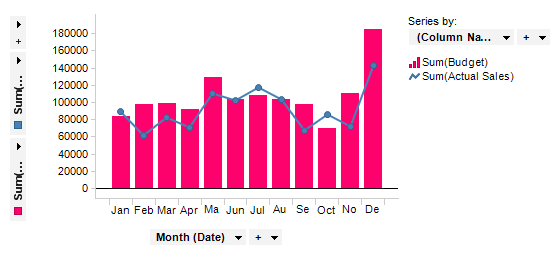
The combination chart is a visualization that combines the features of the bar chart and the line chart. The combination chart displays the data using a number of bars and/or lines, each of which represent a particular category. A combination of bars and lines in the same visualization can be useful when comparing values in different categories, since the combination gives a clear view of which category is higher or lower. An example of this can be seen when using the combination chart to compare the projected sales with the actual sales for different time periods.
Series
Similarly to the function of Color by in other visualizations, Series by in the combination chart is a way to divide the data into slices. The difference is that the slices in the combination chart, called series, can be defined as bars or lines as well as being colored separately. That is, each series in the combination chart will be represented by a line or a set of bars in the visualization.
Example:
The example below contains two series: the bars represent the projected sales for each month in a year and the line represents the actual sales for the same months. Series by is set to (Column Names) since both series should be shown on the Y-axis. For more information on (Column Names), see the Non-Column Selections page.
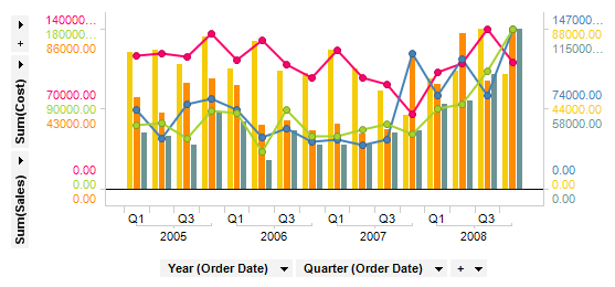
Multiple scales can also be used on the Y-axis when you want to compare several lines and bars with significantly different value ranges.
All visualizations can be set up to show data limited by one or more markings in other visualizations only (details visualizations). Combination charts can also be limited by one or more filterings. Another alternative is to set up a combination chart without any filtering at all. See Limiting What is Shown in Visualizations for more information.
See also:
How to Use the Combination Chart