For many visualizations, there are up to four special options available on the column selector menu: (Column Names), (Subsets), (Row Number), and (Row Count). The use of these options is best described with examples.
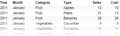
The data table below contains sales data for a company's total business during a year, all the sales of fruit and vegetables for 2001.
It has two separate columns stating the sales and cost of each transaction, and we now want to compare the total sum of sales to the total sum of cost.
In the image below, we have set up a bar chart where the value axis shows sum of sales, and also sum of cost. The problem now is to decide what to show on the category axis. Normally, we would select a column from the column selector, and each unique value in that column would correspond to a bar. However, this will not help us achieve the bar chart we want now, as seen below.
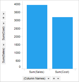
Instead, we select the (Column Names) option from the category axis selector. This means that we take the value column names used on the value axis, and create a bar for each of these names. Since the scale is the same, we can easily plot the two columns as bars beside each other.
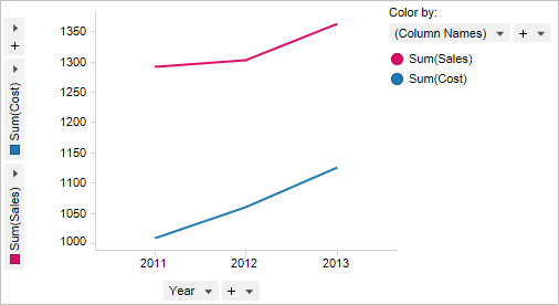
In another example where the data table contains several years, we use a line chart to see the trends of the sum of sales and the sum of cost over the years. Again, the Y-axis shows sum of sales and sum of cost, but we want the X-axis to show the years. We therefore have to set (Column Names) on another visualization property in order to see the two different lines. By setting Color by to (Column Names) we get two lines with different colors, one for each column on the Y-axis.
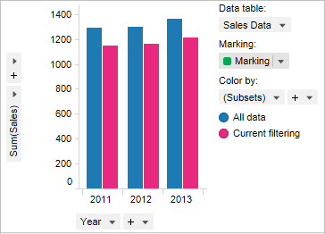
The second special option for the column selectors is called (Subsets). This option is used to display different subsets of data, like all data/filtered data or marked items simultaneously. You can set up which subsets should be available in the visualization using the Subsets tab of the Visualization Properties dialog. There are more examples available on the What are Subsets? and How to Work with Subsets pages.
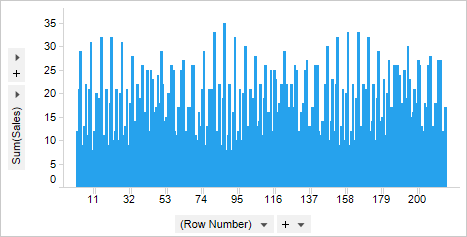
The third special option for the column selectors is called (Row Number). This will plot a bar for each row in the data table (when used on the category axis of a bar chart). As mentioned before, we would normally select a column from the column selector, and each unique value in that column would correspond to a bar. If several rows have the same identical value, these will be aggregated and displayed as the same bar, showing the sum or average of the included values.
Selecting (Row Number) on the category axis selector will let you see each individual transaction (row) as an individual bar, which can be useful for spotting extreme values.
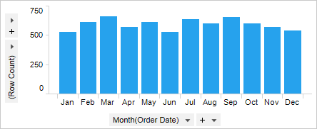
The fourth special option is called (Row Count), and is used when you want a visualization to display the number of rows in your data table. If you select (Row Count) on the value axis of a bar chart, the height of each bar will show the number of rows that correspond to the selected column on the category axis. The bar chart below shows sales data by order date for each month of a year. (Row Count) was selected on the value axis, which means that the height of each bar shows the number of orders for each month.
Tip: You can specify a Display name in the expanded column selector to set the name to Number of orders instead of (Row Count).
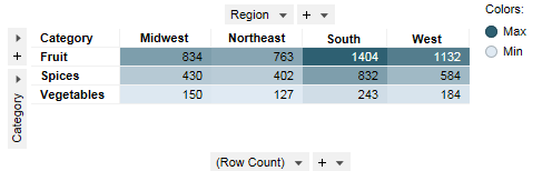
In the example below, a cross table shows the number of sales transactions for fruit, spices, and vegetables in four different sales regions. Each cell in the cross table displays the total number of sales transactions, and in this example the rows have also been colored by (Row Count) to further highlight the cell values.
See also: