The light and dark visual themes are predefined appearances of the user interface. However, it is possible to customize the visual appearance according to your preferences. Using the light or dark theme as starting point, you can change different visual attributes, for example, colors, fonts, borders, and spaces between objects.
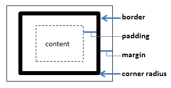
The model below explains some of the objects' attributes that can be adjusted.
The actual content within an object is surrounded by a border. Within this bordered area, you can specify the padding, that is, the width of the space on each side of the content. You can also set border colors, widths and corner radii. Margins to other objects in the user interface can be specified as well.
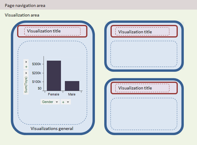
The type of attributes described above can be applied at different places in the user interface like the visualizations and their titles, the page navigation area, and the visualization area as illustrated below.
The settings are made in the Edit CustomTheme dialog.