Marking in Visualizations
The purpose of marking items (for example, bar segments,
pie sectors, lines, or markers) or rows in a visualization may be to view
details for the item, or to distinguish rows in order to tag, copy, delete,
or in other ways manipulate them. Marked rows can either be given an identifying
color in the visualizations, or, they can be kept as they were while all
unmarked items are faded out:
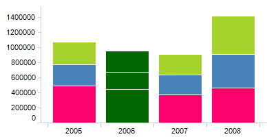
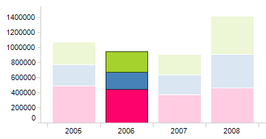
Use separate color for marked items |
Use when? |
Result |
Selected
|
Use this
type of marking when it is important to distinguish all marked
items and see them as a group, and the original colors of the
items are of less importance. |
|
Cleared
|
Use this
type of marking when the color of the marked items is important. |
|
Normally, marking items in one visualization will also
mark items in other visualizations using the same or a related data table.
However, if the analysis contains multiple markings (see
below), only visualizations using the same marking as the one you
modify will be affected by the marking operation.
Note: If markings are to be
reapplied after reloading linked data, you need to specify key columns
that can be used to uniquely identify the rows in each data table. See
Details on Select
Key Columns for more information. When working with in-db data, marking
in table visualizations is only supported if the underlying database table
has a primary key defined.
Since markings are
based on the values included in the item at the time of marking, there
may be situations where the addition of new rows to the data causes an
update to the item (e.g., increases the number of values in a bar) but
the number of marked items is not updated. In this case you may need to
redo the marking to include the new values.
Click on the item.
Response: The marked item is given a different
color or the other items are faded out. Related visualizations are
also updated so that items where the marked item is included are set
to the marked color.
Note: Marking a pie or a bar is equivalent to marking all the
rows that are included in that pie or bar.
Click and drag with the mouse
to draw a rectangle enclosing the interesting items.
Comment: You can also mark a section on an axis
to include all items within that section, see below.
Comment: If you want to mark several items that
are spread out in the visualization so that they cannot be enclosed
by a rectangular shape, you can use lasso marking instead. Press and
hold down the Alt key and
draw a shape of any form to enclose the items of interest.
Note: Lasso
marking cannot be applied to table visualizations.
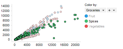
The axes settings displayed in the legend can be used to
mark items of a certain category. For example, in the scatter plot below,
the setting on the Color by axis is used to mark all items in the Spices
category, that is, all the green items in the visualization. To indicate
in the legend that the Spices category is marked, the other categories,
Fruit and Vegetables, are dimmed.
Open the legend in the visualization.
In the legend, move the cursor
over the axis category you want to mark.
Response: An axis category that can be used for
marking is indicated by a dotted line beneath the category.
Comment: You cannot use the legend to mark items
on axes with continuous data. Only categories on the color, shape
and series axes can be marked. If coloring rules are applied on a
color axis, no matter the data is categorical or continuous, it is
possible to use them to mark items.
Select the category to mark
all its items.
In a visualization with axes,
mark items by placing the mouse pointer in the area of the scale labels
and then click and drag with the mouse along the axis.
Response: A rectangle is drawn across the visualization
so that you can mark all values between two specified axis values.
Comment: Marking along the value axis in the bar
chart is slightly different than normal rectangle marking; Only those
bars with the top part of the bar included within the axis-marking
rectangle will be marked. This allows you to select bars with heights
within a specific span.
Press and hold Ctrl.
Click on items you want to
add, one by one. Alternatively, click and drag with the mouse around
several items (while still pressing Ctrl).
Comment: To add more items using the lasso marking
technique, press and hold both Ctrl
and Alt when you draw a shape
to enclose the items you want to add to the marked set.
Comment: To add more items using the legend, press
and hold Ctrl, and then select
another category on an axis.
Select
Edit > Document Properties.
Click
on the Markings tab.
Click
on the marking of interest and then click on Edit.....
Change
the color and click OK.
Click
OK to close the Document Properties dialog.
Comment: If multiple
markings are used within the analysis, you can switch between
these in the legend or visualization properties of all visualizations.
Open the Properties
dialog for the visualization.
Comment: This is done by right-clicking on the
visualization and selecting Properties from the pop-up menu.
Click on the Appearance
page in the list on the left.
Locate the Use
separate color for marked items check box and make sure it
is selected.
Comment: Clear the check box to keep the color
for marked items and instead fade out unmarked items.
Tip: If you always
want to use a specific type of marking for a certain visualization
type you can change the default setting for each visualization type
under Tools > Options. An administrator
can also change the company defaults using preferences in Administration
Manager.
Unmark all data by selecting
Edit > Marked Rows > Unmark. Alternatively,
you can unmark everything by clicking on an empty area in the visualization.
Re-marking any marked items
while Ctrl is pressed will unmark them.
Click to mark a new item.
If Ctrl is not pressed, only
the new item will be marked.
Open the Properties
dialog for the visualization.
Comment: This is done by right-clicking on the
visualization and selecting Properties from the pop-up menu.
Click on the Labels
page in the list on the left.
Response: The Labels page is displayed. Note that
not all visualizations support labels.
Select a column to Label
By.
Click the Show
labels for: Marked rows radio button.
Click Close.
Comment: If you want to use an image in the label
you may need to apply some other settings as well. See the Labels
property page for your specific visualization for more information.
For example, Scatter
Plot Properties - Labels.
You can use marked items in a visualization to filter to
data when you are working with in-memory
data tables.
Make sure you have marked
the items you want to filter to in the analysis.
Right-click in the visualization
and select Marked Rows > Filter
To.
Response: Only the marked items remain visible,
all other items are filtered out. A new column called "Filtered
to at..." with the two values Yes and No is also created in the
data table, as well as a corresponding check box filter.
Comment: The new column and filter make it easy
to toggle between viewing all items or only the marked items. There
is always just one column for filtered to items in the same data table.
If you mark items and select Filter To again, the existing column
will be updated with the new selection.
You can use marked items in a visualization to filter out
data when you are working with in-memory
data tables.
Make sure you have marked
the items you want to filter out in the analysis.
Right-click in the visualization
and select Marked Rows > Filter
Out.
Response: The marked items are filtered out in
the visualization. A new column called "Filtered out at..."
with the two values Yes and No is also created in the data table,
as well as a corresponding check box filter.
Comment: The new column and filter make it easy
to toggle between viewing all items or only the unmarked items. There
is always just one column for filtered out items in the same data
table. If you mark additional items and select Filter Out again, the
additional filtered out items will be added to the previously created
column. You cannot remove items from the created column.
Using the Keyboard and Mouse to Mark Rows
Using combinations of keyboard and mouse interaction, you
can perform more advanced marking. The most common keyboard interaction
is to hold down the Ctrl key while
clicking and dragging the mouse over a set of items to add these to an
already existing marking. You can also "step" between items
using the arrow keys on the keyboard.
Below is a list of all the keyboard and mouse interaction
you can use to mark items.
Action |
Description |
Mouseover item |
Highlight
item. |
Click
on item |
Mark clicked
item and unmark all other items. |
Ctrl
+ click on item |
Toggle
mark for clicked item. Leave other items as is. |
Shift
+ click |
Useful
in table visualizations, where you mark all items between the
previously marked item and the clicked item. All other items are
unmarked. |
Ctrl
+ Shift + click |
Useful
in table visualizations, where you mark all items between the
clicked item and the previously marked item. Other items are left
as is. |
Alt
+ click |
Press Alt
and click on a column header or row header in the cross table
to mark the entire column or row. |
Click
and drag |
Mark items
within the drawn rectangle and unmark all other items. When you
start to drag, a transparent rectangle is shown indicating the
area to be marked. |
Alt
+ click and drag |
Mark items
within the drawn area of any shape and unmark all other items.
When you press Alt and start to drag, a transparent shape is shown
indicating the area to be marked. This marking technique, lasso
marking, is useful when the items you want to mark cannot be enclosed
within a rectangle because of the way they are spread out in the
visualization.
Note:
Lasso marking is not applicable to table visualizations. |
Ctrl
+ click and drag |
If none
of the items in the drawn rectangle are marked, they are added
to the marked items.
If all items in the rectangle are marked,
they are unmarked.
If some items in the rectangle are marked
and some not, the marked items will stay marked and the unmarked
items will be added to the marked items. |
Ctrl
+ Alt + click and drag |
If none
of the items in the drawn area are marked, they are added to the
marked items.
If all items in the area are marked, they
are unmarked.
If some items in the area are marked and some
not, the marked items will stay marked and the unmarked items
will be added to the marked items.
Note:
Lasso marking is not applicable to table visualizations. |
Shift
+ click and drag |
Marks the
entire line in a line chart if the drawn rectangle contains parts
of the line. |
Up/Down/Left/Right
Arrow key |
Mark the
first item above/below/left/right of the previously marked item
and unmark all other items. |
Shift
+ Up/Down/Left/Right Arrow key |
Extend
the set of marked items up/down/left/right, unless the next item
is already marked. If the item is already marked, unmark the previously
marked item. |
Ctrl
+ Up/Down/Left/Right |
Move highlight
up/down/left/right. |
Space |
Mark the
highlighted item. Unmark other items. |
Ctrl
+ Space |
Toggle
mark for highlighted item. Keep other items as is. |
Ctrl
+ A |
Mark all
the filtered rows. |
Ctrl
+ E |
Unmark
all the marked rows. |
Ctrl
+ I |
Invert
the current marking. |
Del |
Delete
all the marked rows. |
Ctrl
+ M |
Filter
to the marked rows. |
Ctrl
+ Shift + M |
Filter
out the marked rows. |
Multiple markings
A marking is what identifies marked rows in the data tables
of an analysis. If you have multiple data tables in your analysis, you
may want to use different markings for the different data tables. For
example, if two data tables are completely unrelated to each other it
may be a good idea to use different markings with different marking colors
for those two data tables. This would lessen the risk of interpreting
the marked data in the two data tables as being related to each other.
If the data tables
are related, the marked rows can be propagated using the specified key
relation between the data tables, provided that the same marking is used.
Setting a marking in one data table does not affect the marking of unrelated
data tables. Each analysis can hold multiple markings and each marking
can display its own marking color. One or more markings can be used to
limit what data is displayed in a visualization.
Select
Edit > Document Properties.
Comment:
You can also define new markings from the Data page of any Visualization
Properties dialog.
Go
to the Markings tab.
Click
on the New... button next to the Available
Markings list.
Specify
a Color for the new marking.
Specify
a Name.
Click
OK.
Right-click
on the visualization and select Properties
from the pop-up menu.
Go
to the Data page.
Use
the drop-down list to select a different Marking.
Comment: The Marking selector may also be shown
in the legend.
See
also:
Highlighting
in Visualizations