This is an example of multiple related data tables. The visualizations are based on different data tables that are related. Marking items in one visualization will mark the corresponding items in the related visualizations. Filtering data in one data table may filter the related data in the other data tables. The relation between the data tables is set up in TIBCO Spotfire. Visualizations that are related share the same color in the color stripe to the left in the visualization. Filters belonging to related data tables also share the same color stripe.
Note: Related visualizations can be placed on different pages in an analysis. This means that markings that are not visible at the moment can affect the analysis that you are looking at.
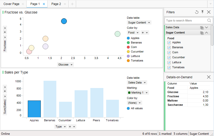
In this case, two data tables with information about fruit and vegetables are related. The scatter plot shows the amount of glucose and fructose for different types of fruits and vegetables, while the bar chart shows the sum of sales for the same types of fruits and vegetables. Marking an item in the scatter plot, in this case the one with the highest level of fructose (Apples), will mark the Sum(Sales) for Apples in the bar chart.
See also:
How to handle Multiple Related Data Tables in One Analysis