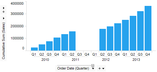
Sometimes you may work with data where some category values are missing. If the visualizations make use of a Date, Time or DateTime column and you like to present the data in an aggregated form, missing data may have strange effects on your calculations. For example, below is a cumulative sum of sales for a few years, where data for three quarters are missing:

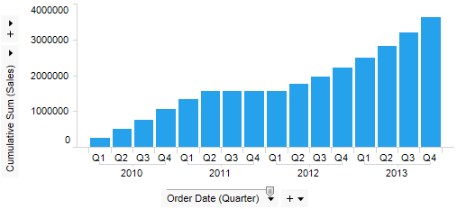
In this example, you might want the bars for the missing quarters to be of the same size as the last available bar rather than completely missing. This can be accomplished by using Compensate for missing values via the Appearance page of the visualization. Compensate for missing values is available in the bar chart, line chart and combination chart. It introduces a gap-filling mechanism where empty values can be temporarily inserted for the missing rows. This way, the cumulative sum can instead show the same value as the last available bar for the bars with missing data:

Note: Compensate for missing values only works with true Date, Time or DateTime columns. The check box will have no effect on a hierarchy made by putting together string values from different columns (such as Year, Month and Day).
Data values in general can be valid values (non-null and non-error), invalid values (errors, such as a value of a different data type than the rest), or empty values (where the row identifier is there, but there is no value in the value column). There may also be completely missing categories. For most kinds of data, this may be difficult to handle, but time-series can be filled out with the missing data points, since it is always possible to calculate which time points should have been available. TIBCO Spotfire can temporarily add the missing rows and fill them with empty values so they can be used in calculations.
When Compensate for missing values is used, the max and min values in the time column are determined. Then all missing steps, depending on the time hierarchy level, are added.
Multiple date/time parts on different axes can be combined in a visualization as long as the same date/time column is used.
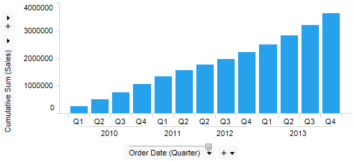
When categorical time values are used in a visualization, you can control what to show using the Categories setting on the axis. If you want to completely hide those categories where no data is available (either due to filtering or to missing data) this can be done by selecting the Show Filtered Values setting:

In the first image on this topic, there is an example of a visualization with missing values where no compensation for missing values has been made and the Show Filtered Range setting has been selected. This option will only hide empty categories on each side of the range, but not in the middle. There is also an option to Show All Values where the currently filtered-out values on the sides also remain visible.
Change the setting in the Advanced Settings dialog or by right-clicking on the visualization axis and selecting Categories and one of the options from the pop-up menu. Use zoom sliders to work with continuous time axes.
Mixed Hierarchies
Mixed hierarchies with both date and/or time parts (from the same datetime column) and other categories are supported by treating the categories as part of the group by hierarchy. The combinations to show are specified in the Advanced Settings dialog or using a custom expression.
If the range of the date/time column is significantly larger than the step size, a huge number of rows may be needed when compensating for missing values. For example, this will be the case when the step size is millisecond and you have dates spanning several years. For performance reasons a property limit is defined, determining the max number of rows that can be inserted. The MaxMissingTimeParts property can be changed under Edit > Document Properties, Properties tab. An administrator can also change this preference by going to Tools > Administration Manager, Preferences tab, and then clicking on DataOptimizationPreferences under DataOptimization and editing the MaxMissingTimeParts preference.
Note that the limit for max number of rows to add is based on the size of the span and not on the actual missing values. This means that if the preference value is set too low, you may encounter this limit even though not that many time parts were missing in the current setup. If the message "Could not compensate for missing values. The document property value for MaxMissingTimeParts has been exceeded." is encountered, you might want to increase the property value, but the solution may also be to clear the Compensate for missing values check box or simply to try to reduce the granularity on the time series axis by using a hierarchy slider (if one is available).
Marking Temporarily Added Rows
When a visualization item based on temporarily added rows is marked it will look like a regular marking in the visualization. However, since no real rows are marked, this marking will not be propagated to any other visualizations nor to the Details-on-Demand.
BinByDateTime
A time hierarchy is actually built using the BinByDateTime function. This function uses three arguments: 1) The Date, Time or DateTime column, 2) the hierarchy definition as a string of the date parts separated by dots, and 3) the pruning level (meaning which level to start the hierarchy slider position on). For example, BinByDateTime([Column],"Year.Quarter.Month.Day",2)
BinByTimeSpan
Similarly, a time span hierarchy is built using the BinByTimeSpan function. Binned time spans may be useful, for example, when viewing groups of intermediate times in a sporting context or when analyzing log data. This function uses three arguments: 1) The TimeSpan column, 2) the hierarchy definition as a string of the time span parts separated by dots (e.g., "Hours.Minutes"), and 3) the pruning level (meaning which level to start the hierarchy slider position on). For example, BinByTimeSpan([Column],"Days.Hours.Minutes.Seconds",2)
See also:
Details on Document Properties - Properties
Binning Functions -BinByDateTime