As explained in the Hierarchies chapter, adding multiple columns to the column selectors creates a hierarchy in the visualization. However, you can also add "predefined" hierarchies to your column selectors. A predefined hierarchy is a hierarchy that has been set up while working with the data itself, or while creating a hierarchy filter in the filters panel. These hierarchies are even more powerful, and provide an additional feature in the visualization - the hierarchy slider.
Example of the Hierarchy Slider
Suppose you have a hierarchy filter called Date of Sale, which consists of a hierarchy of Year/Quarter/Month.
Drag this filter and drop it onto the axis selector of the category axis of a bar chart. This is the result:
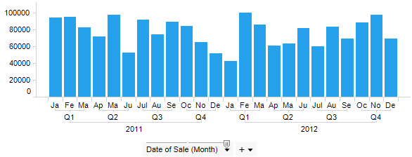
Since the filter was a hierarchy filter, the labels underneath the bar chart states which bars represent the sales for each month, but they also show which months are part of a quarter, and which quarters are part of a certain year.
You will note that there is only one axis selector, unlike in the example using many columns on the axes to build a hierarchy, where there were several axis selectors. You will also note that there is a slider on top of the axis selector. This is the hierarchy slider, a tool that lets you change the level of detail of the visualization. If you were to drag the handle of the hierarchy slider one step to the left, this is what would happen to the bar chart:
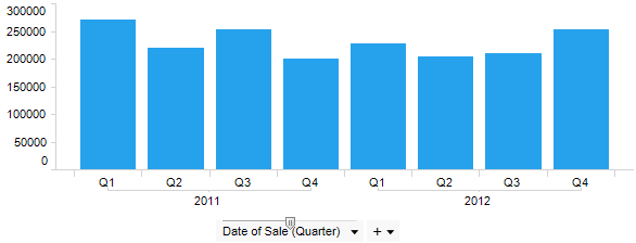
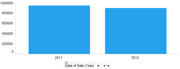
The bars are now automatically updated to show the total sales for each quarter, instead of for each month. Dragging the handle yet another step would update the bar chart to show the total sales for each year.
The hierarchy slider will appear for all predefined hierarchies. These can be geographical trees showing continent/country/city, or product categories and the products therein, etc.
Time Hierarchies
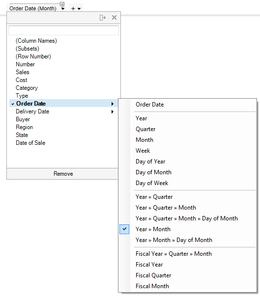
When you are working with time-series data (Date, Time, DateTime or TimeSpan columns) you have the choice to either use a part of the time, date or time span, or to set up a hierarchical structure directly. The hierarchical model allows you to quickly change the time resolution in your visualization. You simply go to the time-series column using the column selector menu, see the lower part of the menu and select the hierarchical structure of your choice. The hierarchy slider will be shown immediately.
Set the level of detail to show in the visualization by using the hierarchy slider as discussed above. See Working with Time Hierarchies for more details about how time-series data can be handled.
If you instead select a single time part you will not have the hierarchy slider available in the visualization and the only time part available will be the one you selected:
![]()
See also: