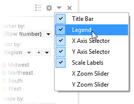
The legend can be displayed either as a temporary popover which is visible until you click somewhere outside it, or as a docked part of the visualization. It can be docked either to the left or to the right in a visualization. If the legend is hidden you can click on the Legend button in the visualization features menu to show it (the icons in the title bar are only shown when hovering with the mouse pointer over the title bar area.):
![]()
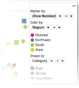
Use the popover when you need to use as much as possible of the screen estate for the visualizations themselves:
The popover can be turned into a docked legend by clicking
on the Dock ikon,![]() , at the top right of the popover.
, at the top right of the popover.
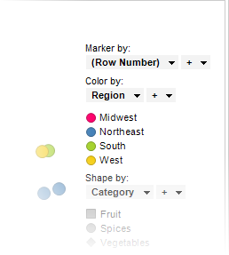
Use the docked legend when the information within it is necessary for interpreting the visualization at all times, or when the visualization is to be exported to another media, such as a PowerPoint presentation, where the popover is unavailable:
The docked legend will be turned into a popover if you click on the Legend button in the title bar.
By clicking on the small arrow icon in the title bar of a visualization you can show or hide the docked version of the legend:
You can also show or hide the docked legend by right-clicking on the visualization and selecting Visualization Features > Legend from the pop-up menu, or by using the Legend page in the Visualization Properties dialog.
Note: If the visualization becomes too small in either direction, controls such as the legend, zoom sliders, axis selectors, etc., are hidden and cannot be viewed until the size of the visualization is increased.
The legend can present things like what parameter in the visualization is represented by each color. Just like for any other column selector, you can click on the column selectors in the legend and pick another column. In the case of coloring, you can also select multiple columns to color by. This means that each unique combination of the values in the columns you pick will get a unique color. You can change the colors used in the visualization directly from the legend. Click on the color box in the legend to open a color palette where you can select another color. Clicking on the shape icon under Shape by similarly allows you to switch shape.
What information is available in the legend by default varies with the visualization type. For example, the legend of a pie chart will show which column determines the size of the pie sectors, and the legend of a scatter plot will state if a column is set to represent marker size or marker shape, etc. You can edit all such parameters, by clicking on the respective column selectors in the legend. When multiple data tables are available in the analysis, the legend for all new visualizations will automatically display a data table selector.
To specify what will be visible in the legend:
In the visualization, right-click to display the pop-up menu.
Select Properties.
Click to display the Legend page.
Select the check boxes for the items you wish to show, and clear the check boxes for items that should be removed from the legend.
By clicking on a legend item in the list on the Legend page the Settings group box becomes enabled (where applicable). Here you can select whether or not to Show title and Show axis selector for the selected item.
Comment: Only legend items that can show both title and axis selector will have the setting available. See the description of the Visualization Properties Legend page for more information.
To change the position of the docked legend:
In the visualization, right-click to display the pop-up menu.
Select Properties.
Click to display the Legend page.
Select the Left or Right radio button..
See also: