This task adds a marker to the latitude and longitude to a map analysis, identifying where a mobile app user is currently located when the user taps the location icon in the app.
About this task
Perform this task in
Spotfire Analyst
Before you begin
You must have completed the following tasks:
Procedure
-
If it's not already open, open the analysis you created in
Adding location capabilities for mobile users.
-
Right-click the map, and in the menu, click
Properties.
-
In the
Map Chart Properties dialog, select
Layers.
-
Click
Marker Layer, and add the Location data table you created in
Adding expressions to find your location to your layers.
-
Select the new Location data table layer, and then click
Settings.
-
In the
Map Layer Settings dialog select
Colors, and set the color so the location value stands out. For example, if your data points are all set to blue, you could set it to red.
-
Click
Shape and select a shape to distinguish the marker, such as an X, a triangle, or a star.
-
Click
Data, and then scroll down to the box
Limit data using expression, and click
Edit.
-
In the
Limit Data Using Expression dialog, select the column
isLocationSet, and then click
Insert Columns.
-
Click
OK to close and save the change, and then close the
Settings and
Properties dialogs.
The column name is added as an expression.
-
Click
Layers make sure that the Location layer is first, the data layer, is second, and the map layer is last.
Results
- When the value of
isLocationSet is set to
False, the marker in the Location map layer does not appear.
- In the map, if the value of latitude and longitude both are not
0, and if the
isLocationSet is
True, the specified shape and color marker appears on the map at the specified latitude and longitude.
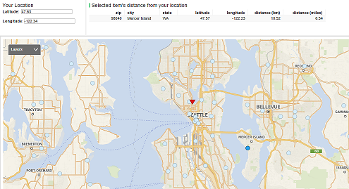
This image shows a map chart with the current location marked by a red triangle and the data points (zip codes) as light blue circles. One data point is selected, and its location is shown with a darker blue circle. Its columns, including distance from the device location, is shown in the Data Visualization.