Adding error bars
Typically, error bars are used to visualize uncertainty in the data. You can add them to visualization items in bar charts, line charts, and scatter plots. The degree of how uncertain an item value is, is indicated by the length of the error bar.
In fact, you can use error bars to indicate also other types of ranges than uncertainty in values, because you have various options to define what the error bar lengths should represent. The examples following the procedure show different use cases.
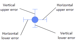
In all the three types of visualizations, where error bars can be added, upper as well as lower vertical error bars can be drawn. In scatter plots, the error bars can also be drawn horizontally.
Procedure
Error bars based on an aggregation
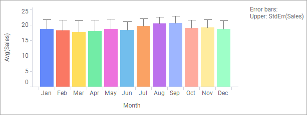
The bar chart shows the average sales per month during one year. To show the uncertainty in the values, the pre-defined aggregation method standard error (StdErr) has been used to calculate the length of the error bars.
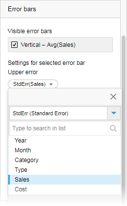
The setting is shown below. The StdErr aggregation is specified on the Upper error selector.A long error bar in this example means that the concentration of values, which the sales average was calculated on, is low, and thus the average value is uncertain. Conversely, a short error bar means that the concentration of values is high, and thus, that the average value is more certain.
Error bars based on absolute column values
The data table below lists already calculated averages and estimated upper and lower errors in absolute values. By, for the 'Average' axis, setting the Upper error to the 'Absolute upper error' column and the Lower error to the 'Absolute lower error' column in a scatter plot, the error bars for each average value represent the actual values in the two error columns.
Error bars based on a custom expression
Instead of using a pre-defined aggregation method, you can specify the length of the error bars by writing your own expression. This is an example where custom expressions are used.
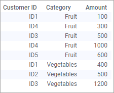
This simple data table lists eight sales transactions.
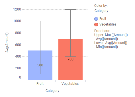
Assume you are interested in visualizing the average sales amount per category in a bar chart, and also in showing between which amounts the transactions vary by means of error bars. Then a custom expression is needed for the error bar calculations. If you directly use the pre-defined Max() and Min() aggregation methods for the amount column as shown below, the variation is drawn incorrectly. It should, for example, be 100-1000 for fruits instead of 400-1500. This is because the error bars are always drawn relative to the marker, meaning the upper end cap equals the sum of the average amount and the max amount (for example, 700+1200 for vegetables).
To show what you intended, right-click the Upper error selector, select Custom expression, and enter the expression that subtracts the average value from the max value:
Max([Amount]) - Avg([Amount])
In the same way, for the Lower error, enter the expression:
Avg([Amount]) - Min([Amount])Now the error bars in the bar chart show between which amounts the transactions vary.

