Visualize data
To represent the data visually, many different types of visualizations are provided, all with different strengths for displaying the data in an informative way.
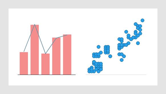
For example, there are visualizations suitable for making comparisons and investigating distributions, correlations or trends in the data as exemplified below. Whether the data is continuous or categorical, if it should be aggregated, and whether one, two, three or more variables needs to be represented, are also of importance when deciding what visualization to use.
When you add a visualization to an analysis, you can do it in three ways:
- Start from the data
By selecting data columns you are interested in among the loaded data, you will get recommendations on visualizations based on these particular columns. Then the visualization of interest can simply be dragged to the analysis page, and if needed, you can fine-tune it there.
- Start from a visualization type
You can simply select the visualization type you want to use, and drag it to the analysis page. Once on the page, you can select which data columns you want to visualize, and how. This way you build the visualization from scratch.
- Search for what you want to visualize
You can search for data you are interested in among existing content and also get recommendations on new visualizations that can be relevant. The visualizations can then be dragged to the analysis page.
No matter method used, you can at anytime modify the properties of the visualization. The properties to change can be anything from changing what data columns are visualized, changing the aggregation method used to summarize the data, to changing colors and fonts, or even switching to another visualization type.
Get started
To add a visualization, on the authoring bar, either
- click
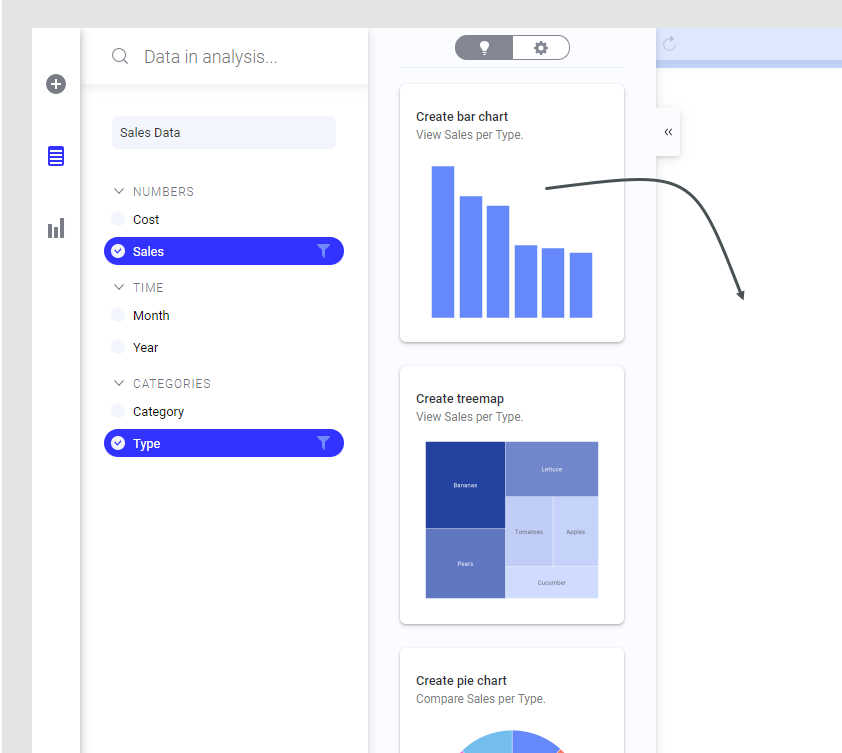
Data in analysis
 , and in the opened flyout, select the data columns you are interested in. Among the visualizations that are recommended, click or drag the one you are interested in to the analysis, and explore it.
- click
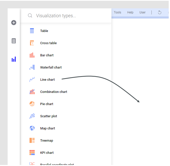
Visualization types
 , and from the opened flyout, click or drag the visualization type you want to use to the analysis page. Then modify the default settings to make the visualization look the way you like.
To add a visualization by using
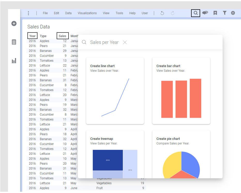
Find
 on the menu bar:
Type, in the opened search field, what you want to visualize, and let us suggest visualizations for the matches found. For example, if you type the names of data columns you want to explore, visualizations are suggested as shown in the image below. Then click or drag the one you are interested in to the analysis, and explore it.
For more information on what you can search for, see Find.