Creating a treemap
A treemap is used for displaying huge amounts of data that can be structured hierarchically (tree-structured). It presents the data using differently sized and colored rectangles.
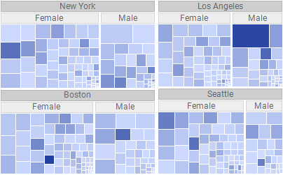
Data in a treemap is organized hierarchically. Each branch in the hierarchy is symbolized by a rectangle, which in turn is divided into smaller rectangles representing sub-branches. Within the different hierarchy levels, the rectangles are sized proportionally by the values in a numerical data column, for example a sales column. The largest rectangle is positioned in the top left corner and the smallest rectangle in the bottom right corner.
For example, below you can see the hierarchy used in the treemap above: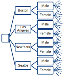
The entire visualization space is used, which makes it possible to present a large amount of data simultaneously. This makes it easy to spot patterns and irregularities in your data by a quick look.
The sizes of the rectangles represent numerical data. Also the colors of the rectangles can reflect numerical data by changing gradually between a color representing the maximum value of your data and another color representing the minimum value. You can choose the same data column for both sizing and coloring, or different data columns. In the treemap above, the sizes of the rectangles reflect one data column, and the colors another.
The different settings are found in the legend: the
Hierarchy axis, the
Size axis, and the
Color axis.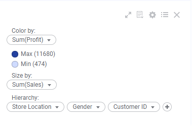
Procedure
 to open the flyout.
Example
The data table below lists how much money different customers have spent at four different store departments. Assume you want to find the "top" male and female customer at the Toys department.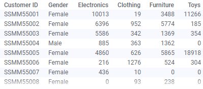
The treemap settings below give you the answer.
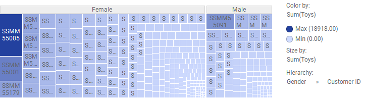
Customer ID SSMM55005 is the woman who spent most money, and SSMM55091 is the man, because these customers' rectangles are the largest in the female and male branches respectively.
Maybe these two customers are the "top" customers at the Clothing department as well. To find out, change the column on the
Color axis to Clothing to see if these rectangles have the darkest color.
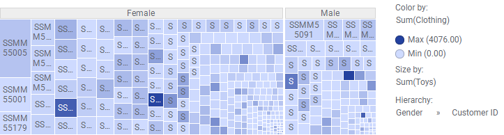
It seems other customers are more interested in clothing than the two customers who spent the most on toys!