Creating a line chart
A line chart is used for showing trends, and in most cases trends over time. It can also be used for discerning certain patterns.
About this task
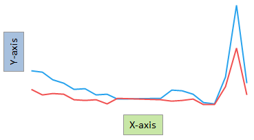
The main axes in the line chart are the X-axis and the Y-axis. To show trends over time, select a time column on the X-axis. For each data point on the X-axis, Y-axis values are placed. These values can represent aggregated data or non-aggregated data for the particular data point. An aggregated value could be, for example, a sum or an average. To draw the "full" line, straight lines are then drawn between these values.
The line chart can consist of one line or of several lines. Several
lines are added if you want to make comparisons of several data columns, or if
you want to make comparisons between different categories within a
column.
Depending on what you want to show, or on how your loaded data is organized, you add lines to the line chart in different ways.
Depending on what you want to show, or on how your loaded data is organized, you add lines to the line chart in different ways.
Comparing data columns
Procedure
-
On the authoring bar, click
Visualization types
 to open the flyout.
Example
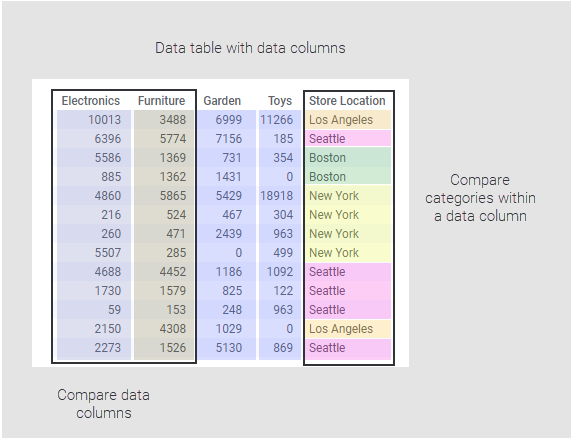
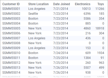
Assume the data below is loaded. It contains customers' electronics
and toys purchases made at different store locations during a time period.
Below see the settings made to compare the sums of purchases made at the Electronics and Toys departments.
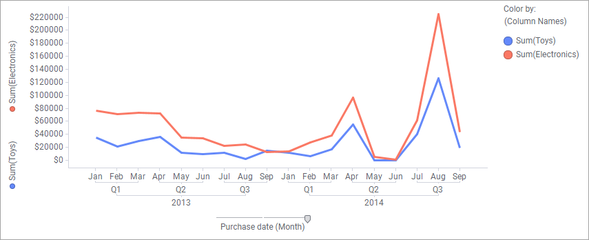
Below see the settings made to compare the sums of purchases made at the Electronics and Toys departments.
Comparing categories within a column
Procedure
-
On the authoring bar, click
Visualization types
to open the flyout.
Example
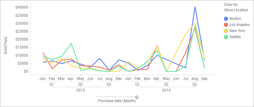
The data shown in the example above is loaded. Below see the
settings made to compare the sum of Toys purchases at different store
locations.