Example 7: Simple Regression Analysis
- Data File
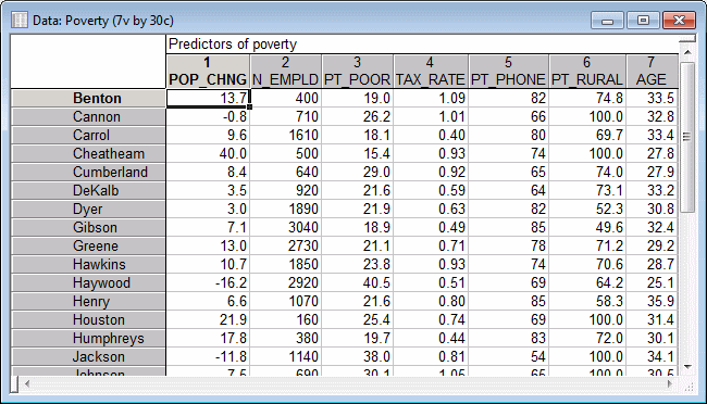
- This example is based on the data file Poverty.sta that is included with your STATISTICA program. The data are based on a comparison of 1960 and 1970 Census figures for a random selection of 30 counties. The names of the counties were entered as case names. The following image shows part of the file.
Ribbon bar. Select the Home tab. In the File group, click the Open arrow and select Open Examples to display the Open a STATISTICA Data File dialog box. Open the data file, which is located in the Datasets folder.
Classic menus. From the File menu, select Open Examples to display the Open a STATISTICA Data File dialog box. Open the data file, which is located in the Datasets folder.
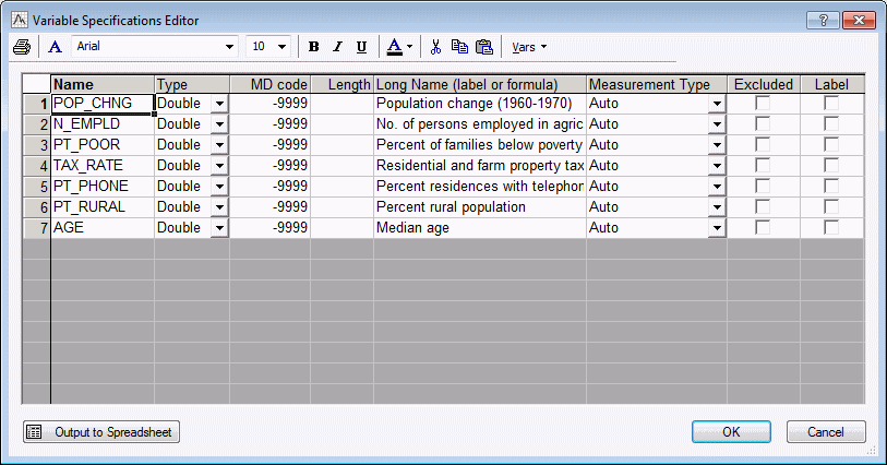
The following image shows the Variable Specifications Editor, which lists information for each variable. To display the Editor:
Ribbon bar. Select the Data tab. In the Variables group, click All Specs.
Classic menus. from the Data menu, select All Variable Specs.
Click the Cancel button to close the Editor.
- Research Question
- For this example, one possible correlate of poverty will be analyzed and the degree to which it predicts the percent of families below the poverty line in a county will be determined. Thus, you will treat variable 3 (PT_POOR) as the dependent or criterion variable.
One possible hypothesis is that population change and the percent of families below poverty level are related. It seems reasonable to expect that poverty will lead to outward migration; thus, there should be a negative correlation between the percent below poverty level and population change. Accordingly, you will treat variable 1 (POP_CHNG) as the predictor variable.
- Specifying the analysis
- Start General Linear Models:
Ribbon bar. Select the Statistics tab. In the Advanced/Multivariate group, click Advanced Models and from the menu, select General Linear to display the General Linear Models (GLM) Startup Panel.
Classic menus. From the Statistics - Advanced Linear/Nonlinear Models submenu, select General Linear Models to display the General Linear Models (GLM) Startup Panel.
Select Simple regression as the Type of analysis, select Quick specs dialog as the Specification method, and then click the OK button to display the GLM Simple Regression Quick Specs dialog box.
Click the Variables button to display the standard variable selection dialog box. Select PT_POOR in the Dependent variable list, POP_CHNG as the Predictor variable, and then click the OK button to return to the GLM Simple Regression Quick Specs dialog box.
To view the syntax program automatically generated from the specifications, click the Syntax editor button in the GLM Simple Regression Quick Specs dialog box to display the GLM Analysis Syntax Editor.
The remainder of the specifications for this analysis can use the default specifications, so click the OK (Run) button in the GLM Analysis Syntax Editor or the OK button in the GLM Simple Regression Quick Specs dialog box to perform the analysis.
Reviewing Results
- Regression coefficients
- When the
GLM Results dialog box is displayed, select the
Summary tab. Click the Coefficients button to produce a spreadsheet containing the coefficients for the regression of PT_POOR on POP_CHNG.
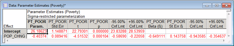
In the POP_CHNG row, Param. column, the unstandardized regression coefficient for the regression of PT_POOR on POP_CHNG is -0.40374. This means that for each unit decrease in population, there is a .40374 unit increase in poverty. The upper and lower (default) 95% confident limits for this unstandardized coefficient do not include zero, so the regression coefficient is significant at p<.05. Note that the standardized coefficient, which is also the Pearson correlation coefficient for simple regression designs, is -.65, which means that for each standard deviation decrease in population there is a .65 standard deviation increase in poverty.
- Distribution of variables
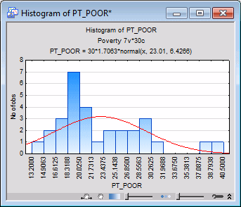
- Correlation coefficients can become substantially inflated or deflated if extreme outliers are present in the data, so let's examine the distribution of the dependent variable PT_POOR across counties.
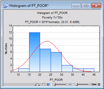
Right-click on the PT_POOR Param. column heading in the spreadsheet that was just created, and select Graphs of Input Data - Histogram PT_POOR - Normal Fit from the resulting shortcut menu to display the following default histogram.
Via the Histogram command on the Graphs tab or menu, you can produce the histogram of variable PT_POOR with more intervals. (On the 2D Histograms dialog box - Quick tab, click the Variables button and select PT_POOR, and then click the OK button; then enter 16 in the Categories box in the Intervals group box, and click the OK button.) As you can see in the next image, the distribution for this variable deviates somewhat from the normal distribution. However, even though two counties (in the two right-most columns) have a higher percentage of families below the poverty level than what would be expected according to the normal distribution, they still seem to be sufficiently "within range."
This decision is somewhat subjective; a general rule is that one needs to be concerned if an observation (or observations) falls outside the mean ± 3 times the standard deviation. In that case, it is wise to repeat critical analyses with and without the outlier(s) to ensure that they did not seriously affect the pattern of intercorrelations.
- Scatterplots
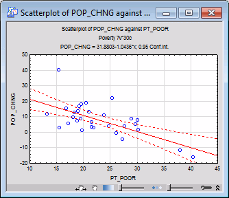
- If you have a priori hypotheses about the relationship between specific variables, it may be instructive to plot the respective scatterplot. Select the
GLM Results - Matrix tab to access the options for displaying matrices. Click the Correlation button to display the spreadsheet with the correlation matrix.
Right-click on the cell (correlation) that intersects the POP_CHNG column and the PT_POOR row, and select Graphs of Input Data - Scatterplot by - Regression, 95% conf. from the resulting shortcut menu. A variable selection dialog box is displayed, with PT_POOR selected as the X variable. Select POP_CHNG as the Y variable, and click the OK button to produce the default scatterplot.
This scatterplot illustrates the substantial negative correlation (-.65) between the two variables. It also shows the 95% confidence limits for the regression line, that is, you can be 95% certain that the actual regression line in the population falls within the limits defined by the two curved, dashed lines.
- Test of significance
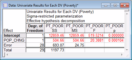
- Return to the
GLM Results - Summary tab and click the Univariate results button to display a spreadsheet containing tests of significance.
The test for the POP_CHNG regression coefficient confirms that POP_CHNG is strongly related to PT_POOR, p<.001.
- Summary
- This example has shown how to analyze a simple regression design. Interpretation of unstandardized and standardized regression coefficients was illustrated. The importance of examining the distribution of responses on the dependent variable was discussed, and techniques for determining the direction and the strength of the relationship between the predictor and the dependent variable were demonstrated.
See also GLM - Index.