Conceptual Overviews - Categorized Histograms
In general, histograms are used to examine frequency distributions of values of variables. For example, the frequency distribution plot shows which specific values or ranges of values of the examined variable are most frequent, how differentiated the values are, whether most observations are concentrated around the mean, whether the distribution is symmetrical or skewed, whether it is multimodal (i.e., has two or more peaks) or unimodal, etc. Histograms are also useful for evaluating the similarity of an observed distribution with theoretical or expected distributions.
The histogram procedure available from the Graphs menu allows you to produce histograms broken down by one or two categorical variables, or by any other one or two sets of logical categorization rules (via multiple subsets categorization).
There are two major reasons why frequency distributions are of interest.
- You can learn from the shape of the distribution about the nature of the examined variable (e.g., a bimodal distribution may suggest that the sample is not homogeneous and consists of observations that belong to two populations that are more or less normally distributed).
- Many statistics are based on assumptions about the distributions of analyzed variables; histograms help you to test whether those assumptions are met.
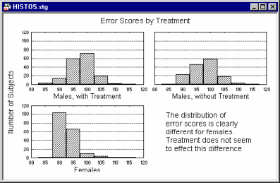
Often, the first step in the analysis of a new dataset is to run histograms on all variables. Using categorized histograms can make the results more informative,
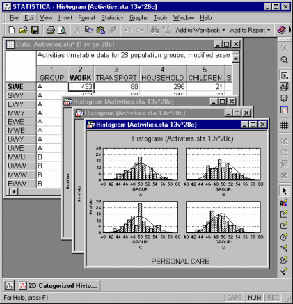
and reveal, for example, a lack of homogeneity of the sample.
Histograms vs. Breakdown
Categorized Histograms provide information similar to breakdowns (e.g., mean, median, minimum, maximum, differentiation of values, etc.; see Basic Statistics and Tables). Although specific (numerical) descriptive statistics are easier to read in a table, the overall shape and global descriptive characteristics of a distribution are much easier to examine in a graph. Moreover, the graph provides qualitative information about the distribution that cannot be fully represented by any single index. For example, the overall skewed distribution of income may indicate that the majority of people have an income that is much closer to the minimum than maximum of the range of income. Moreover, when broken down by gender and ethnic background, this characteristic of the income distribution may be found to be more pronounced in certain subgroups. Although this information will be contained in the index of skewness (for each sub-group), when presented in the graphical form of a histogram, the information is usually more easily recognized and remembered. The histogram may also reveal "bumps" that may represent important facts about the specific social stratification of the investigated population or anomalies in the distribution of income in a particular group caused by a recent tax reform.
Categorization of Values within Each Histogram
All histogram procedures offer the standard selection of categorization methods; see Method of Categorization for more details.
Those categorization methods divide the entire range of values of the examined variable into a number of categories or sub-ranges for which frequencies are counted and presented in the plot as individual columns or bars.
Categorization of Values into Component Graphs
The categorization options for assigning observations to the component graphs of the categorized histogram are equally flexible. Component graphs may be created for the levels of a categorical variable (e.g., gender), continuous variables may be categorized into a user-defined number of intervals, or user-defined logical subsetting conditions may be specified to determine each sub-group.
The latter option is particularly powerful, because it allows you to base the categorization on "rules" that reference more than one variable, and on the logical relationships between those variables (e.g., a subgroup might consist of all individuals who are male, 30 or older, and divorced or never married).
- Categorized histograms and scatterplots
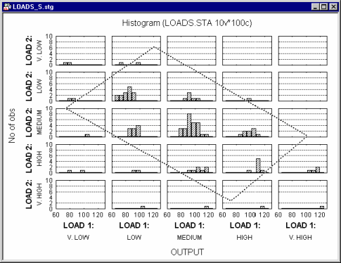
- A useful application of the categorization methods for continuous variables is to represent the simultaneous relationships between three variables. Shown below is a scatterplot for two variables Load 1 and Load 2.
Now suppose you want to add a third variable (Output) and examine how it is distributed at different levels of the joint distribution of Load 1 and Load 2. The following graph could be produced:
In this graph, Load 1 and Load 2 are both categorized into five intervals, and within each combination of intervals the distribution for variable Output is computed. Note that the "box" (parallelogram) encloses approximately the same observations (cases) in both graphs shown above.