Conceptual Overviews - 2D Histograms
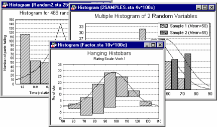
The 2D Histograms procedure contains a selection of univariate and multivariate (non-categorized) histograms.
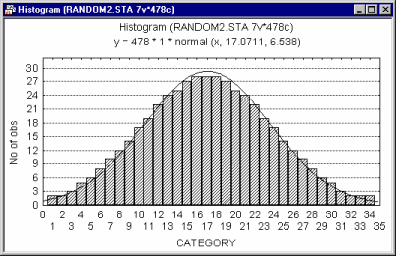
Histograms (the term was first used by Pearson, 1895) are used to examine frequency distributions of values of variables. For example, the frequency distribution plot shows which specific values or ranges of values of the examined variable are most frequent, how differentiated the values are, whether most observations are concentrated around the mean, whether the distribution is symmetrical or skewed, whether it is multimodal (i.e., has two or more peaks) or unimodal, etc. Histograms also allow you to evaluate the similarity of an observed distribution to theoretical or expected distributions.
There are two major reasons why frequency distributions are of interest:
• One can learn from the shape of the distribution about the nature of the examined variable (e.g., a bimodal distribution may suggest that the sample is not homogeneous, and consists of observations that belong to two populations that are more-or-less normally distributed).
• Many statistics are based on assumptions about the distributions of analyzed variables; histograms help one to test whether those assumptions are met.
Often the first step in the analysis of a new data set is to run histograms on all variables. [Note that if more than one variable is selected for any type of univariate Histogram (see below), a series of graphs, one for each variable, will be created and can be reviewed in a results workbook, report, or cascade of stand-alone windows; see Five Channels for Output from Analyses.]
Histograms vs. Descriptive Statistics
Histograms provide information similar to descriptive statistics (e.g., mean, median, minimum, maximum, differentiation of values, etc.). Although specific (numerical) descriptive statistics are easier to read in a table, the overall shape and global descriptive characteristics of a distribution are much easier to examine in a graph. Moreover, the graph provides qualitative information about the distribution that cannot be fully represented by any single index. For example, the overall skewed distribution of income may indicate that the majority of people have an income that is much closer to the minimum than maximum of the range of income. Although this information will be contained in the index of skewness, when presented in the graphical form of a histogram, the information is usually much more easily recognized and remembered.
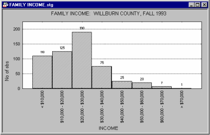
The histogram can also reveal "bumps" that may represent important facts about the specific social stratification of the investigated population or anomalies in the distribution of income caused by a recent tax reform.
Categorization of Values
All Graphs menu graphs histogram procedures offer the standard selection of categorization methods. Those categorization methods divide the entire range of values of the examined variable into a number of categories or sub-ranges for which frequencies are counted and presented in the plot as individual columns or bars (horizontal bars are plotted when the X-Y Axis Position box on the Options 2 tab of the graph specification dialog is set to Reversed).
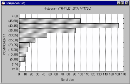
For example, one can create a histogram where each column would represent a range of 10 units on the scale used to represent the variable; if the minimum value is 0 and the maximum is 120, then 12 columns would be created. Alternatively, you can request that the entire range of values of the variable be divided into a specific number of equal size intervals (e.g., 10); in the latter case, if the minimum value is 0 and the maximum is 120, then each interval would be equal to 12 units of the scale. There are also options supported to generate more complex categorizations. For example, you can create uneven ranges by custom-defining boundaries for each range (e.g., in order to create more interpretable ranges or to concatenate outliers and increase the readability of the middle part of the histogram). The ranges can also be created by defining specific inclusion or exclusion criteria using logical statements (e.g., the first column in the histogram could represent persons who traveled by plane more than 10 times in the last year and who are not traveling more than 50% of the time on business; etc.).
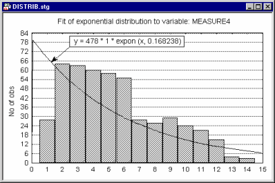
Fitting Theoretical Distributions to Observed Distributions
The distribution fitting facilities integrated with histograms allow you to compare the observed data to a selection of common distributions including Normal (see below),
Beta, Exponential, Extreme, Gamma, Geometric, Laplace, Logistic, Lognormal, Poisson, Rayleigh, and Weibull.