QC Charts Example 11: Specifying CuSum Charts
Overview. In this example you will learn how to specify a CuSum chart. In this chart, a running sum of the deviations of the individual measurements from the center line or specification is drawn. This chart is particularly powerful in detecting small drift. Note that Statistica computes the recommended tabular or algorithmic CuSum chart, and not the "old-style" V-mask control limits that were commonly in use when these charts were (literally) made by hand. The example data set and CuSum chart described in this example can be found in Montgomery (1996, p. 319). The computational details and parameter settings for this specific example chart are also described there in detail (see also Computation Details).
- Specifying the Analysis
- Open the data file Cusum.sta via the File - Open Examples menu; it is in the Datasets folder. Select Quality Control Charts from the Statistics - Industrial Statistics & Six Sigma submenu or from the Data Mining - Process Optimization - QC Charts submenu to display the
Quality Control Charts Startup Panel. Then select CuSum chart for individuals on the
Variables tab. Click the
Real-time tab and select the Auto-update option button. Now click the OK button to display the
Defining Variables for CuSum X and moving range dialog.
In this dialog, specify for which variable the chart should be created. There is only one variable in this case, so click the Variables button and select Var1 as the Variable with measurements.
Click OK to produce the chart.
- Reviewing the chart
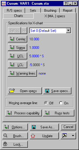
- We now want to change the specifications. Click on the
X (MA..) specs tab and click the Center button. In the resulting
Chart center line dialog enter 10 into the Process mean box and click OK. Then click the Sigma button and enter 1 into the Process sigma box on the resulting
Sigma for dialog and click OK.
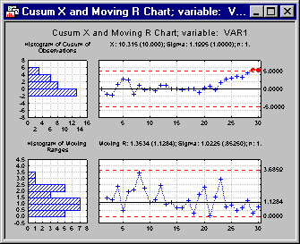
Now click the Update button to update the chart.
The last two seem to indicate an out-of-control condition.
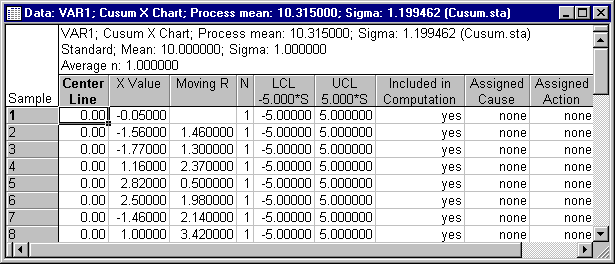
We can also look at the descriptive statistics by clicking the Descriptives button on the Charts tab. Two spreadsheets will be produced. Below is a partial listing of the spreadsheet for the process mean.
See also QC Chart Examples.