QC Charts Example 7: Specifying Moving Average/Moving Range charts
- Overview
- In this example you will learn how to create a control chart for moving averages and moving ranges. Those types of charts are useful for detecting slight upward or downward trends of the process mean or process variation over time. We will use the same data file (Cover.sta) as in the first example. For further explanations, see Example 1: Specifying Control Charts for Variables, Process Capability. Assuming that we are concerned with process shifts that lead to an increasing average width of cover plates, we would like to detect such a process shift as early as possible as such a situation may cause production of an unacceptable number of non-conforming units.
- Specifying the Analysis
- Open the data file Cover.sta via the File - Open Examples menu; it is in the Datasets folder. Select Quality Control Charts from the Statistics - Industrial Statistics & Six Sigma submenu or from the Data Mining - Process Optimization - QC Charts submenu to display the
Quality Control Charts Startup Panel. Then select MA X-bar & R chart for variables on the
Variables tab. Click the
Real-time tab and select the Auto-update option button. Now click the OK button to display the
Defining Variables for MA X-bar and R Chart dialog.
Click the Variables button on the Quick tab, select Width as the Variable with measurements, and click OK.
Because we take constant samples of three observations from the ongoing manufacturing process, select the Constant sample size check box and enter the value 3.
Furthermore, we need to determine the span of the moving average and the method of estimating the process sigma.
The span controls how many adjacent samples are used for each individual moving average that is displayed in the chart. For example, if we specify a span of three then the first moving average is computed from sample 1 to 3, the second moving average from sample 2 to 4, and so on. Note that the span determines how "jagged" or "smooth" the line of moving averages in the chart will be. The larger the span value, the smoother the line (and thus the more salient the global trend). For now, enter 5 into the Moving average span field.
Click OK to produce the chart.
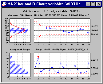
Reviewing the Chart.
By inspecting the chart of moving averages, one could conclude that - although no points cross the control limits - there might be two separate sections. Whereas the moving averages continue to decrease from the beginning up to sample 9, the start increasing again thereafter. Also, you will get runs rules violations (2 of 3 samples in Zone A or beyond) for the default runs rules settings when you click the Runs tests button in the Results dialog. This could be another indication that "something is wrong" with the manufacturing process. For the chart of moving ranges there is no indication of a global trend or any other obvious problems. Thus, apparently, the process variation seems to be constant over time.
We may be able to investigate what caused the decreasing trend in the first 9 samples, eliminate this cause of variation, and adjust the process. Note however, that any kind of interpretation is always subjective. In other words, decisions about adjusting the process should not be based on findings of out-of-control conditions or runs rules violations in the control charts only, but also on technical process knowledge.
See also QC Chart Examples.