Example: Creating and Customizing a Simple 2D Graphs Menu Graph
Ribbon bar. Select the Home tab. In the File group, click the Open arrow and on the menu, select Open Examples. The Open a Statistica Data File dialog box is displayed. Irisdat.sta is located in the Datasets folder.
Classic menus. On the File menu, select Open Examples to display the Open a Statistica Data File dialog box; Irisdat.sta is located in the Datasets folder.
This data file, based on the classic example data of Fisher (1936), contains measurements made on length and width of flower parts (sepals and petals) and the corresponding iris flower type (Setosa, Versicol, and Virginic). In this example, we will explore the relationship between two of the variables: sepal length (Sepallen) and petal length (Petallen).
Producing the Graph
Ribbon bar. Select the Graphs tab. In the Common group, click Scatterplot to display the 2D Scatterplots Startup Panel.
Classic menus. On the Graphs menu, select Scatterplots to display the 2D Scatterplots Startup Panel.
On the Quick tab, click the Variables button to display a standard variable selection dialog box.
For the X axis, select Petallen, and for the Y axes, Sepallen.
Click the OK button.
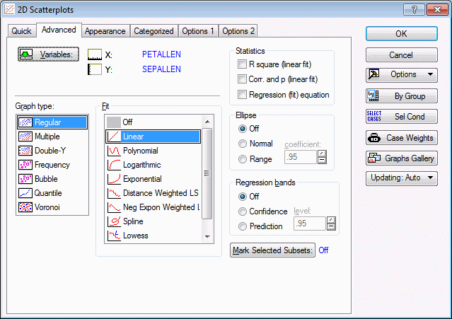
In the 2D Scatterplots Startup Panel, select the Advanced tab.
Note that, by default, a Linear fit is specified for the graph.
Marking SelectedSubsets
In order to explore possible differences in the relationship between sepal length and petal length from flower type to flower type, we want to display the flower types separately on the graph. To do this:
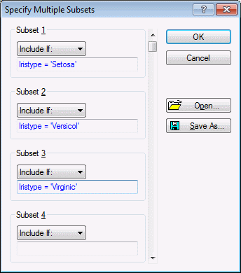
- On the Advanced tab, click the Mark Selected Subsets button to display the Specify Multiple Subsets dialog box. Here, we will specify three subsets to mark on the scatterplot.
- In the Subset 1 group box, ensure that Include if is selected in the drop-down list, and type Iristype = 'Setosa' in the edit field.
- In the Subset 2 group box, ensure that Include if is selected in the drop-down list, and enter Iristype = 'Versicol' in the edit field.
- In the Subset 3 group box, ensure that Include if is selected in the drop-down list, and enter Iristype = 'Virginic' in the edit field.
The Specify Multiple Subsets dialog box will look as follows:
Click the OK button in this dialog box.
Click the OK button in the 2D Scatterplots Startup Panel to produce the graph.
Adding a New Fit Line
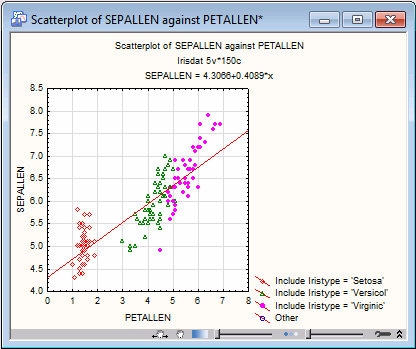
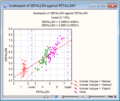
On examination of the graph, it is obvious that the linear relationship displayed is very strongly influenced by the presence of the compact group of Setosa measurements that occur at lower values of both Petallen and Sepallen. It would be of some interest perhaps to explore the relationship between these variables within the Virginic-Versicol group, which on initial examination appears to have a slightly different trend than that calculated for all flower types together. Specifically, we want to add another linear regression line to the plot that includes only the data in the Versicol and Virginic groups.
- Double-click on the outer background area of the graph (i.e., the area immediately outside the scatterplot) to display the Graph Options dialog box.
- Select the Plot: Fitting tab. The linear fit currently applied to the graph data is designated as number 1 in the Fit box.
- Click the Add new fit button to designate an additional fit.
Restricting the Range of the Fit
By default, this fit will be Linear as shown in the Fit type box. We will leave it as linear, although we could easily specify another fit type at this point. We want, however, to restrict this fit to the Versicol and Virginic data. Therefore:
- In the Fitting data group, in the Range box, change the Full Range selection to Custom Range. Inspection of the graph shows we can restrict the X range of data to values that completely exclude the Setosa group.
- In the Min box, enter 2.5, and in the Max box, enter 7.5.
- To display the new fit in a different pattern or color, click the Pattern button in the Line group and choose from the options in the Line Properties dialog box.
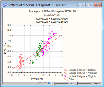
- Click the OK button at the bottom of the Graph Options dialog box to redraw the graph displaying both the original and the newly specified fit lines.
Adding Custom Axis Labels and Limit Lines
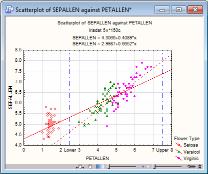
Now we want to display the lower and upper limits of the Versicol and Virginic data used in the new fit.
- Double-click the graph background to display the Graph Options dialog box.
- Select the Axis: Custom Units tab, and in the first line of the spreadsheet area, enter 2.5 in the Position column, enter Lower in the Text column, and select the Grid check box. In the second line of the spreadsheet, enter 7.5 and Upper in the Position and Text columns, respectively, and select the Grid check box.
- Click the Gridlines button to display the Line Properties dialog box, where you can designate a gridline pattern and/or color that will distinguish the new gridlines to be drawn from those already present on the graph. Then click the Close button.
- Select the Axis: Scale Values tab in the Graph Options dialog box, and in the Display scale values group, select the Custom labels check box .
- Select the Off option button in the Skip values group.
- Close the Graph Options dialog by clicking the OK button, and the graph will be updated with the limit labels and gridlines.
Customizing the Legend
Next, we will customize the legend. Double-click on the graph's outer background to once again display the Graph Options (graph customization) dialog box.
On the Graph: Titles/Text tab, the text items associated with the graph legend can be deleted, changed, or supplemented. Note that the Graph Titles/Text dialog box can be displayed directly by double-clicking on the legend.
- In the Title drop-down box, select Right Title. In the window at the top of the dialog box, the legend will be displayed.
- To modify a legend, it must first be disconnected from the graph. Select the legend text in the window, right-click on the highlighted text, and select Disconnect Object(s) from Graph from the resulting shortcut menu.
- Shorten the text items in the legend for better readability to Setosa, Versicol, and Virginic. You can also remove the Other category, completely. See also, Is all graph text editable?.
- To create a legend title, place the mouse pointer on the left side of the first item (point marker symbol) on the legend, type Flower Type, and press the ENTER key on your keyboard.
- Click the OK button at the bottom of the Graph Options dialog box to redraw the graph.
To change properties of the symbols in the legend (i.e., point markers or fit lines) double-click on the item in the graph or access the item on the appropriate tab of the Graph Options dialog box (i.e., Plot: General to change point markers or Plot: Fitting to change the properties of the fit line). Changing the properties of these items on the graph automatically makes the changes in the legend symbols.
Changing Titles and Axis Titles
Finally, we will change the titles and axis titles. Double-click on any graph title or axis title to display a dialog box with options to customize that title. Note that axis titles and graph titles can also be accessed from the Axis: Title and Graph Titles/Text tabs, respectively, of the Graph Options dialog box.
- Right-click the x-axis title (Petallen) and from the shortcut menu, select Title to display the Title dialog box, where Petallen can be changed to Petal Length. The y-axis label can be changed in the same fashion (i.e., change Sepallen to Sepal Length).
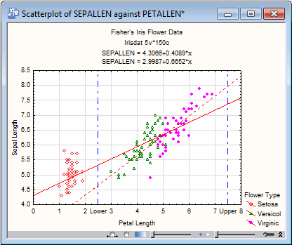
- Similarly, right-click the graph title and select Title Properties to display the Titles/Text dialog box, where the default Scatterplot of SEPALLEN against PETALLEN can be changed to Fisher's Iris Flower Data.
The completed graph (shown above) incorporates changes to legends and titles and the addition of labels and gridlines defining the range of data incorporated into the newly added fit.

